Metal Revolution Music Magazine
Visual ID + website + SoMe
www.metal-revolution.com
Few words about
The project.
After years of collaborating with this online music magazine in form of live photography and numerous graphical and web related tasks, we were hired to create an all-new visual ID for this unique musical webzine.
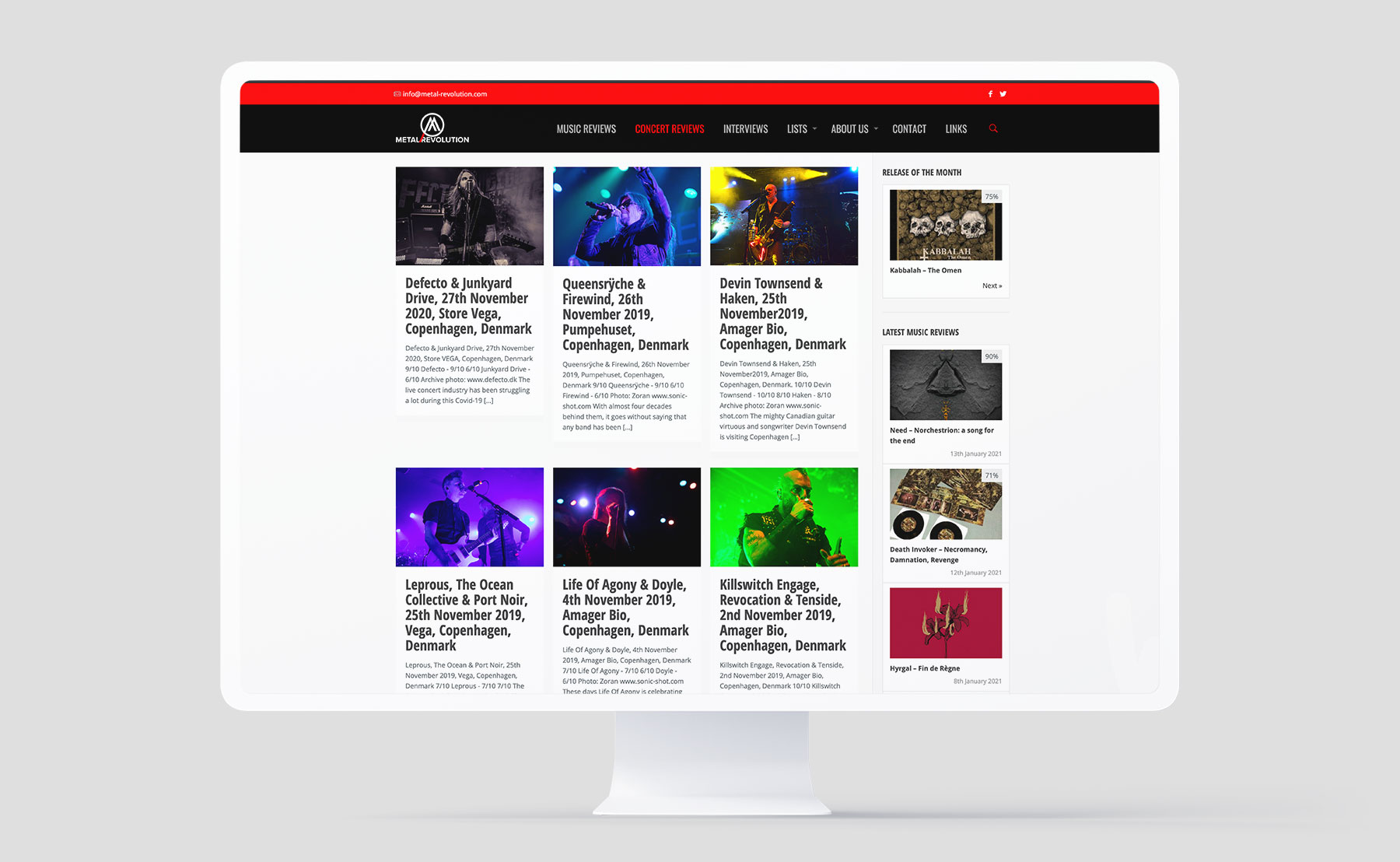
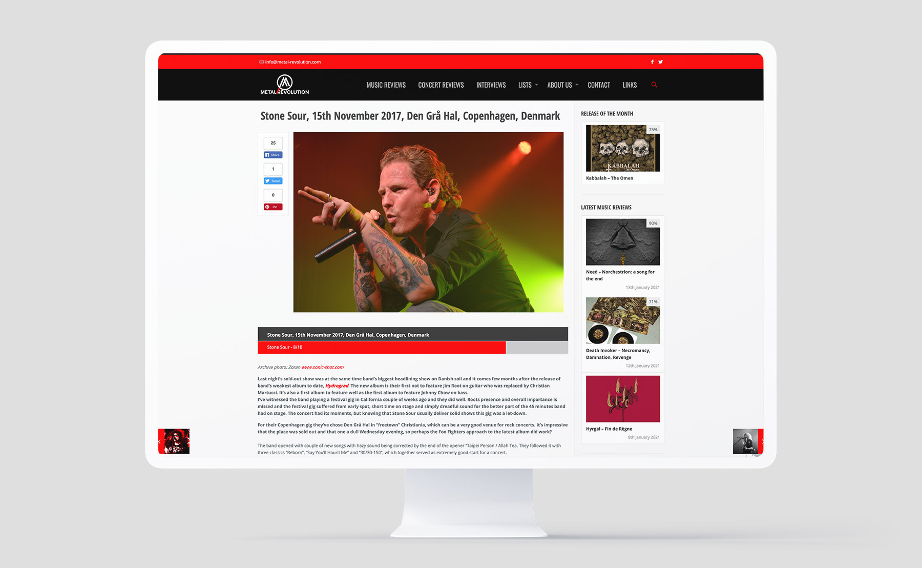
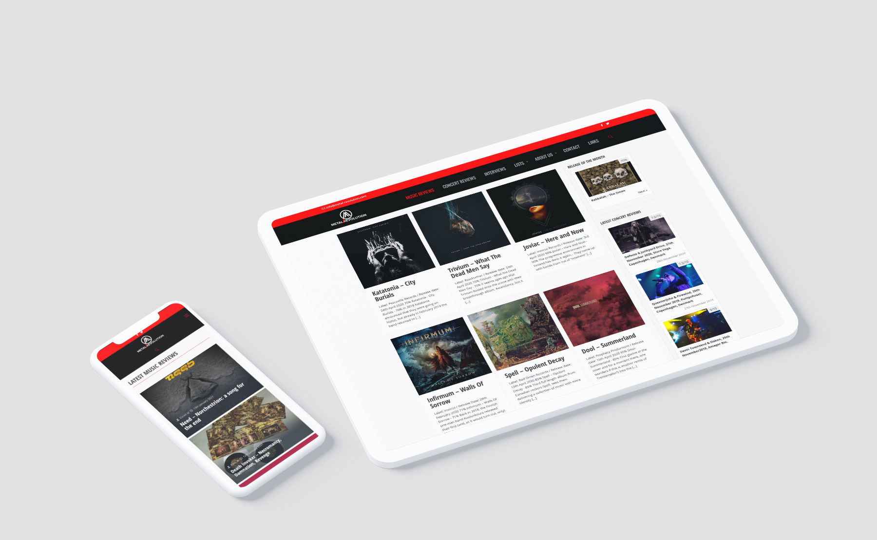
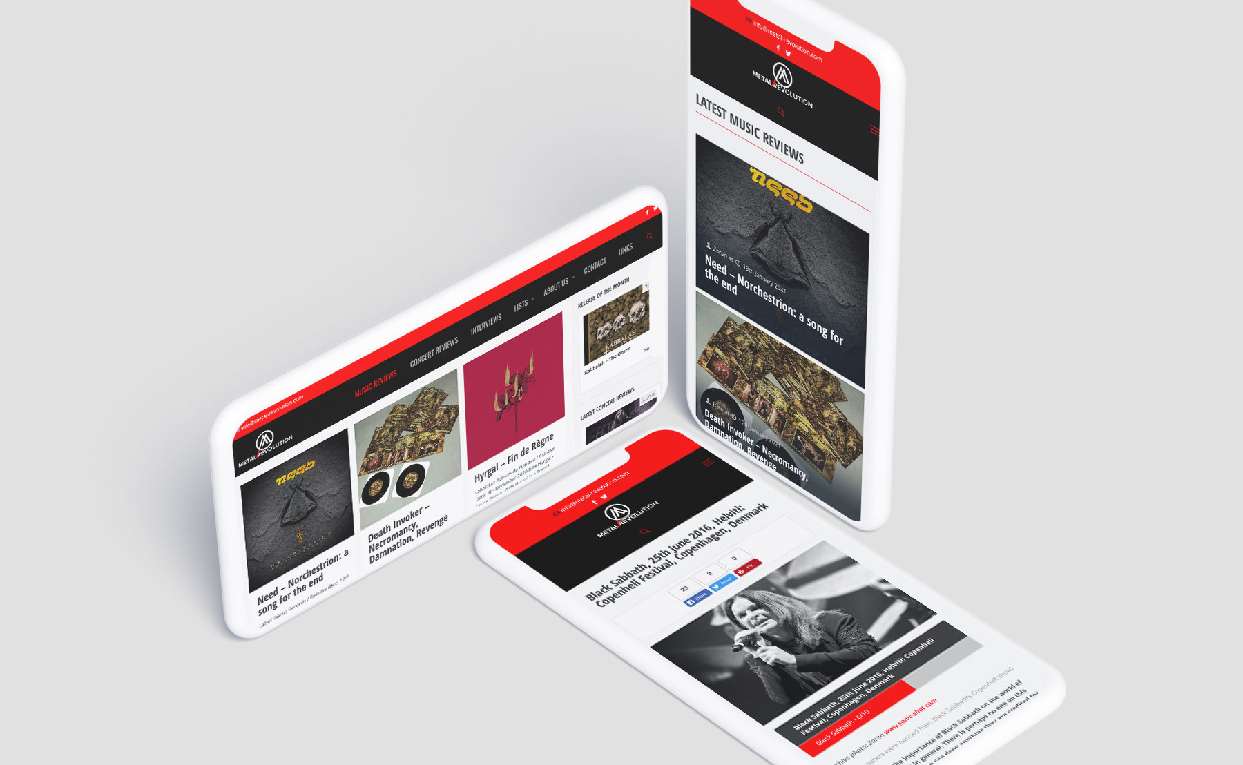
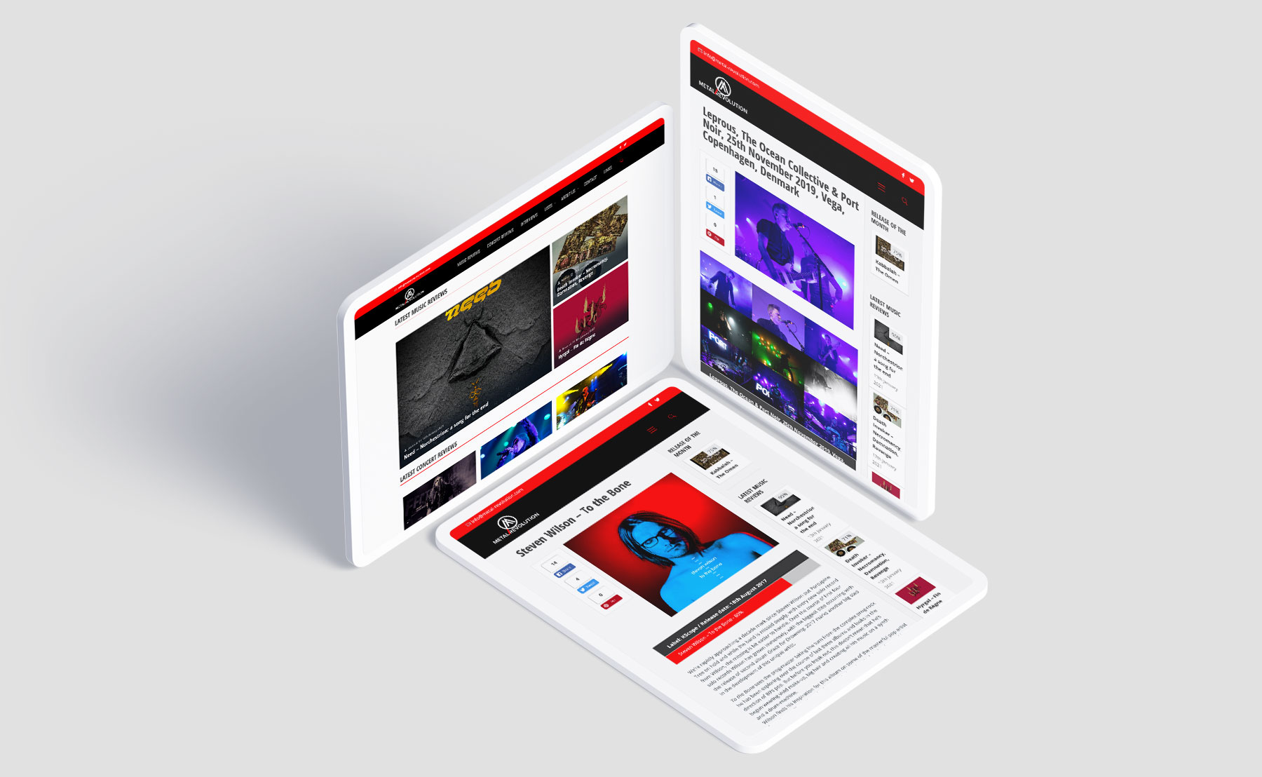
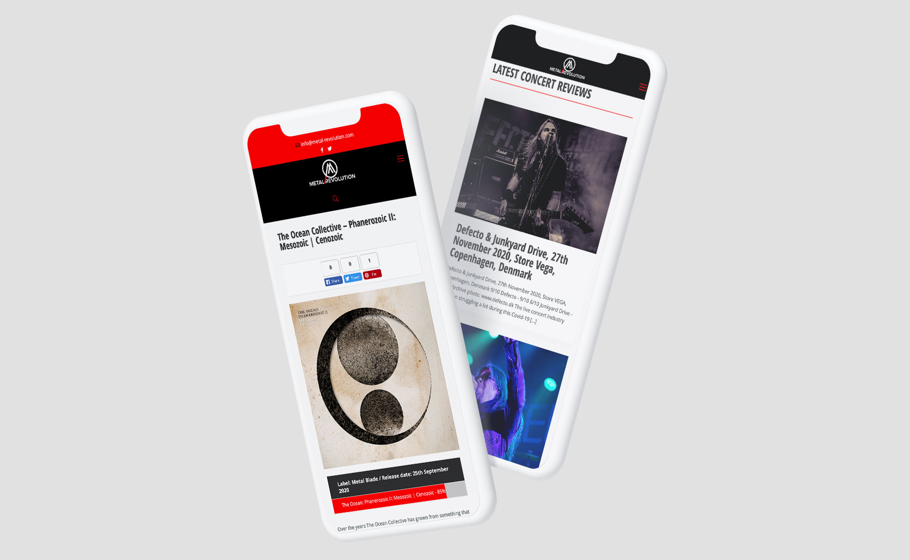
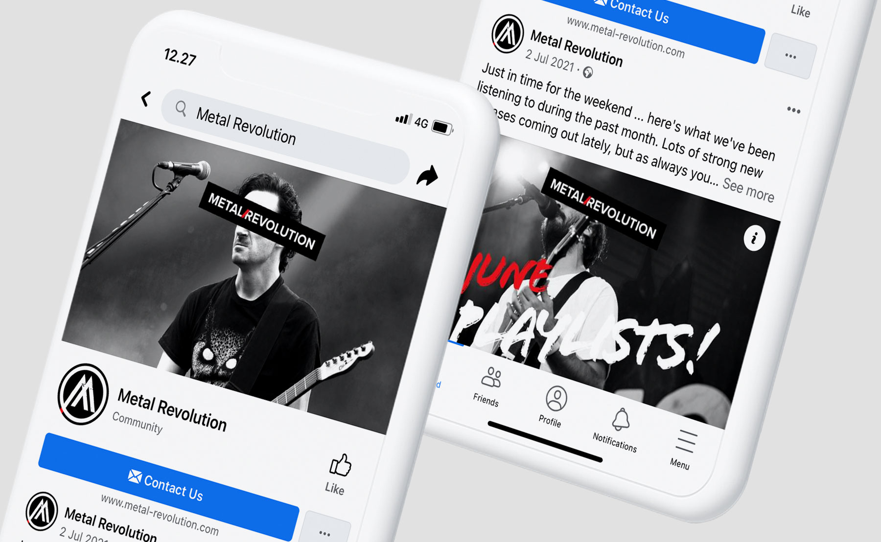
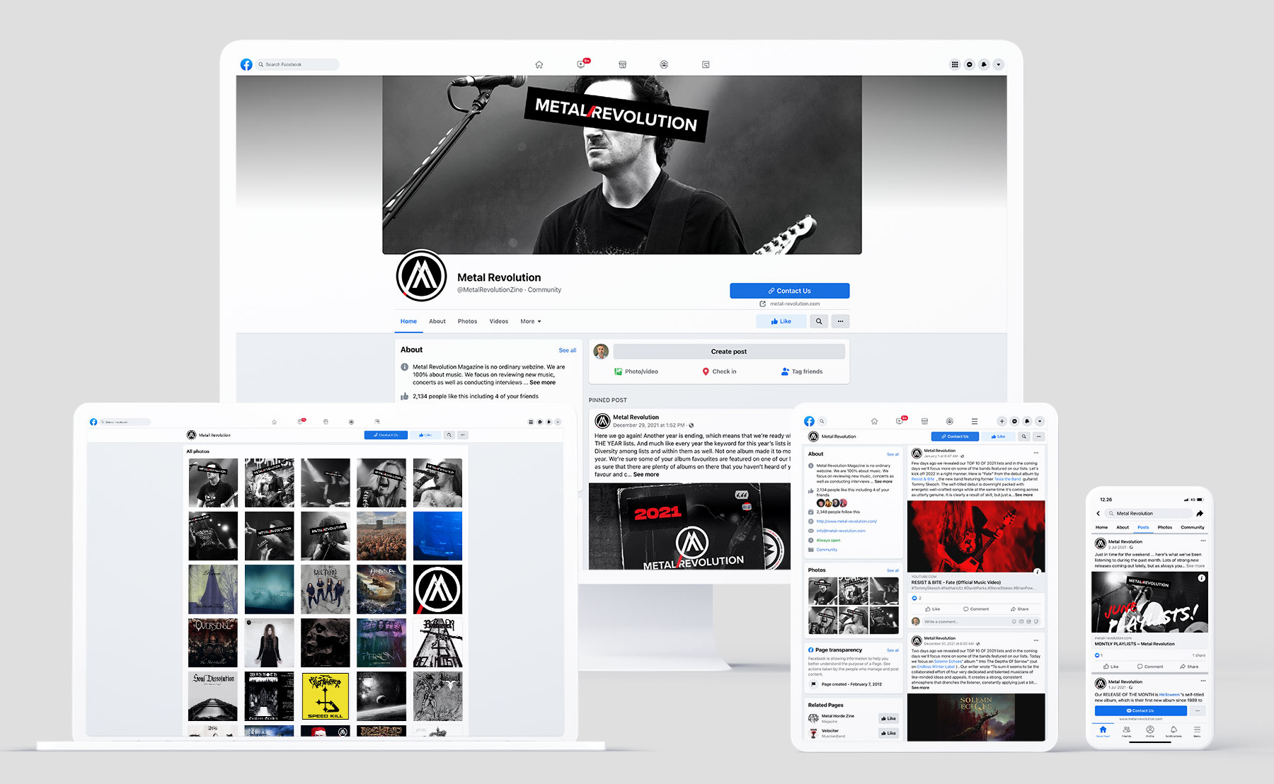
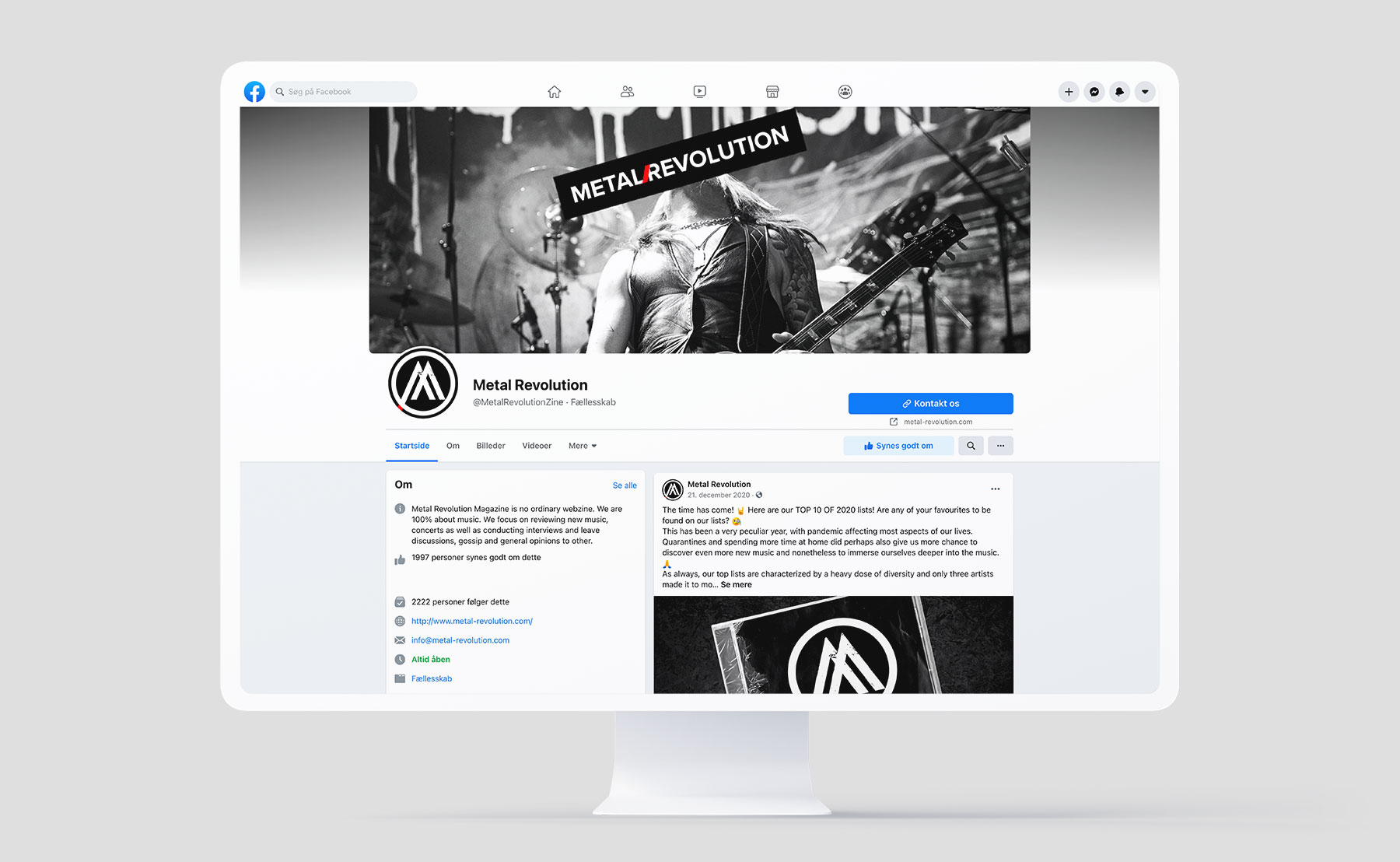
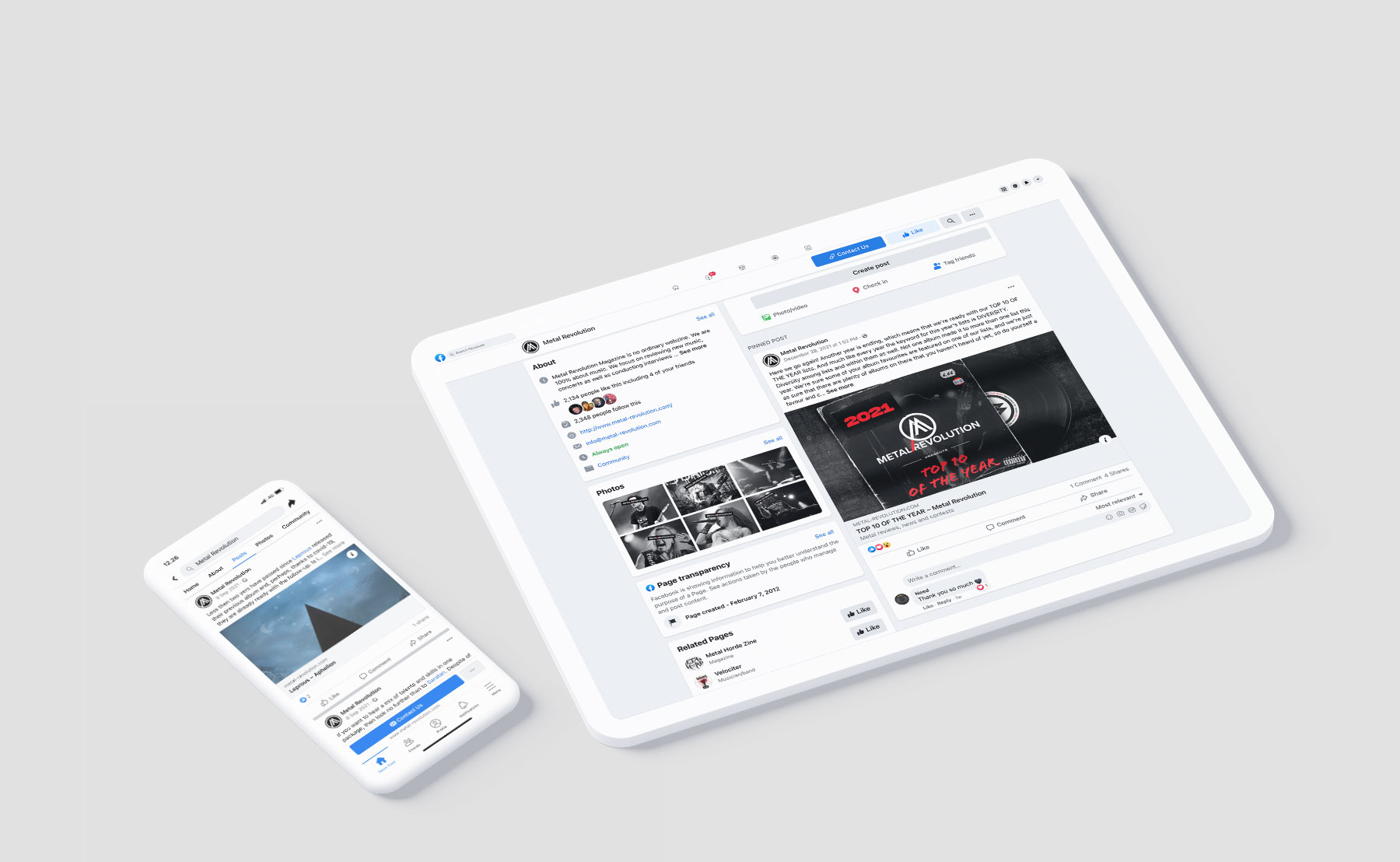
We have also created a completely new responsive website for them.as well as a full migration of data from the old e107 platform to the new WP platform. Besides that we've also created and partly manage their Facebook presence.
We have also created a completely new responsive website for them.as well as a full migration of data from the old e107 platform to the new WP platform. Besides that we've also created and partly manage their Facebook presence.
To find out more about Metal Revolution visit their website. In their own words, however, this is how they describe themselves:
“Metal Revolution is a non-for-profit fanzine, we don’t do this for the cash, we don’t do this because we have to, we do this because we love all sorts of metal and want to share our passion for this kind of music, it’s pretty much as simple as that. Bands, labels, distributions etc. should get in touch! We’re always on the hunt for some new metal to review.”
“Metal Revolution is a non-for-profit fanzine, we don’t do this for the cash, we don’t do this because we have to, we do this because we love all sorts of metal and want to share our passion for this kind of music, it’s pretty much as simple as that. Bands, labels, distributions etc. should get in touch! We’re always on the hunt for some new metal to review.”
Few words about
The logo.
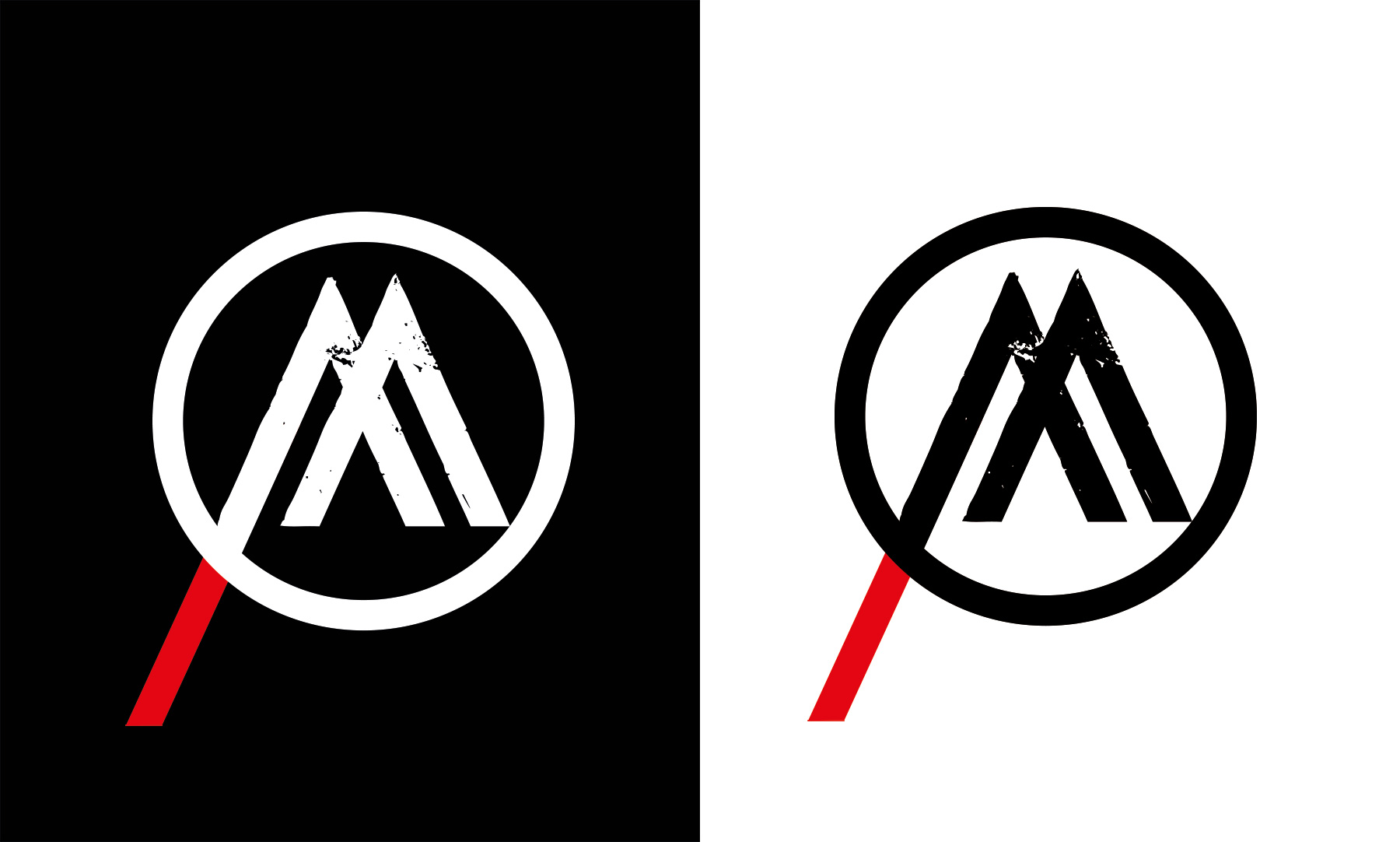
When creating the logo for this project we agreed that the logo should be completely redesigned. It was important that the logo was fresh and current, but at the same time a homage to the entire legacy of the cultural aspects of this musical genre.
We’ve done this by combining the modern visual aspect with those often associated with the given cultural legacy.
The minimalistic, flat and clean aspects of the logo are the dominant ones, but they are combined with minor rough and noise aspects to give the logo the right feel.
Furthermore the logo works well when all the elements are combined as well as separately - when using only name or only "M" part of the logo.
Another big aspect of the logo is the story within the logo. There are number of hints in the logo, which play off logos from some of the most prominent artist of the genre – classic ones as well the modern ones. It was important for us to allude to those, without coming across as apparent.
Those familiar with the genre will quickly notice some clues of artist from 70’s all the way over to the present day. Each such graphical element consists of at least two clues for artist hailing from two different decades.
The overall result is a logo that is contemporary, yet true to the roots and it’s a logo that hold on to numerous layered stories evident to those culturally involved into the genre.
- Metal Revolution: Logo
Few words about
The website.
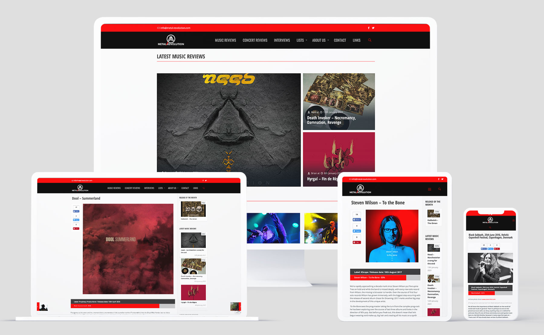
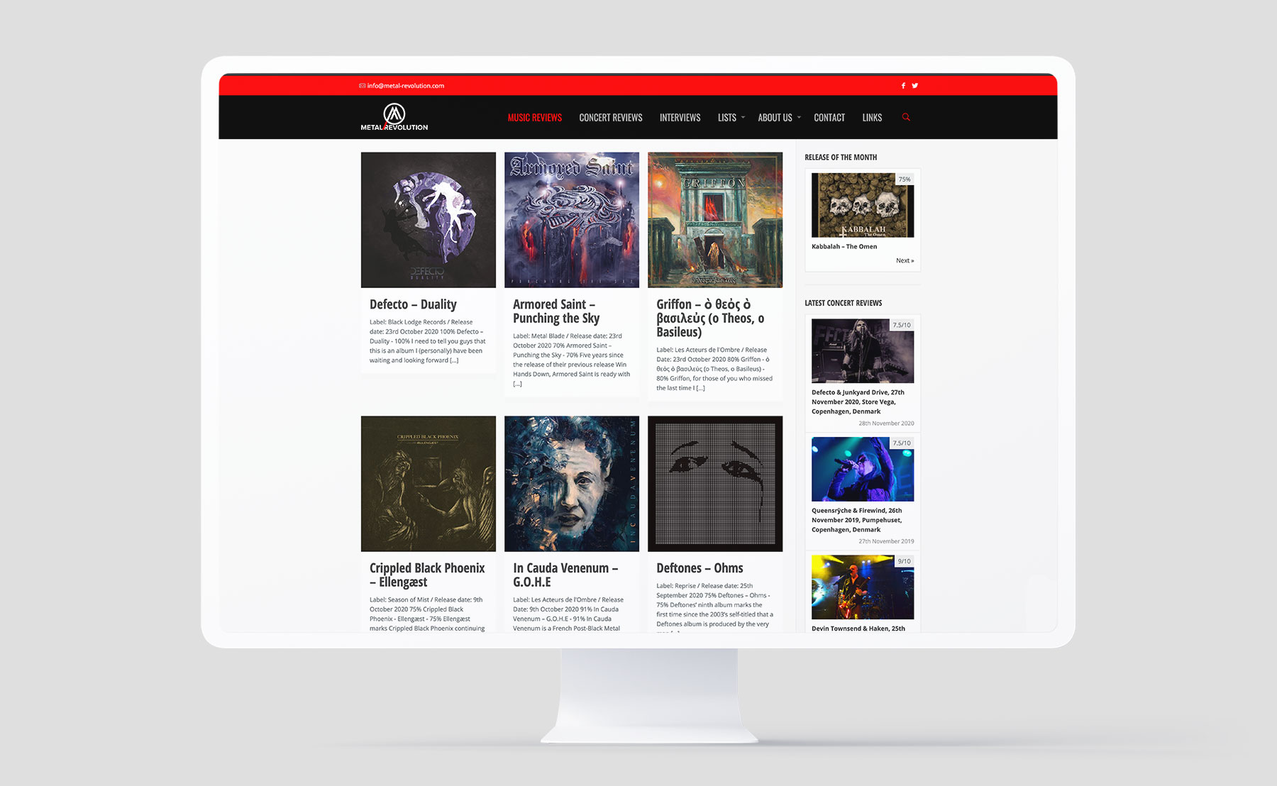
The overall objective was staying true to this online magazine’s long heritage, but we have created a website that is all-new when it comes to layout and functionality. Everything is changed, including the logo, colours, design, platform, navigation, amount of content and just about anything else you can think of.
The idea was to keep it clean, recognizable, user-friendly and nonetheless metal!
The idea was to keep it clean, recognizable, user-friendly and nonetheless metal!
This is one of our biggest project to date, nonetheless because of the massive data migration. The data needed to be migrated between two different platforms, which don’t work together.
We’ve even changed hosting of the site and updated as well as integrated their social media presence.
We are also in charge of constant maintenance of the website
We’ve even changed hosting of the site and updated as well as integrated their social media presence.
We are also in charge of constant maintenance of the website
Few words about
The SoMe.
Once our collaboration with Metal Revolution started, we were also in charge of creating a brand-new Facebook account for this magazine as well as migrating the followers from their old Facebook page. Furthermore, ever since the launch of this SoMe channel we were in charge of developing graphics for monthly, annual events as well as graphics for the overall Facebook page look.

