___It Made Me Smile
Visual ID + website
www.itmademesmile.com
Few words about
The project.
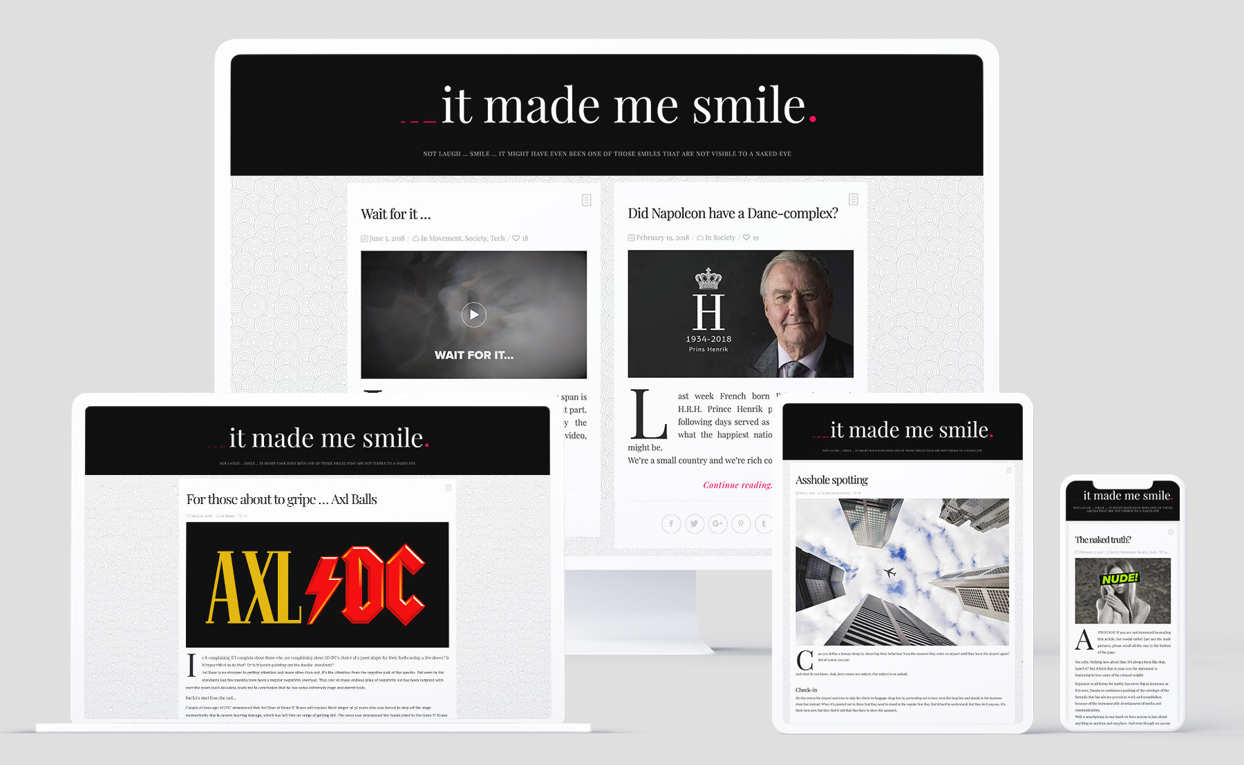
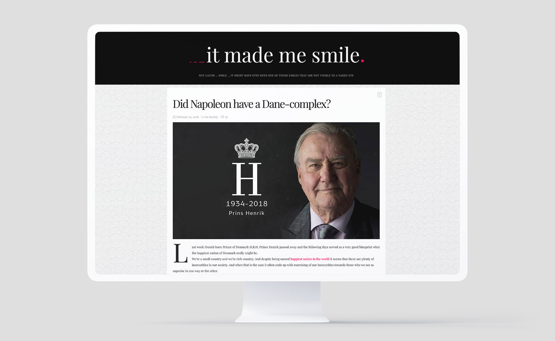
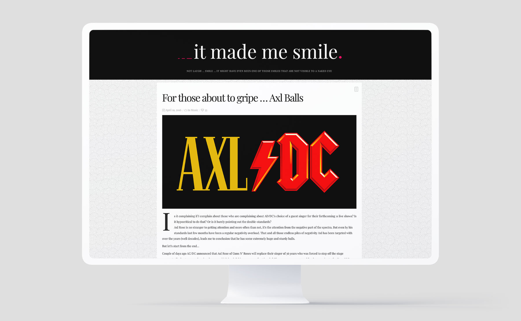
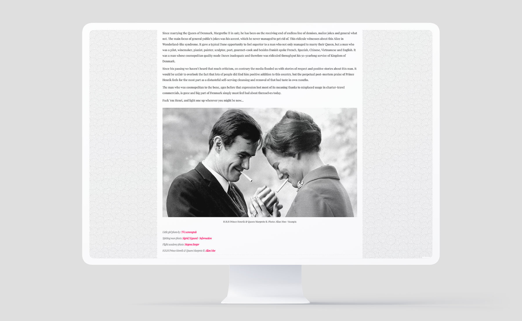
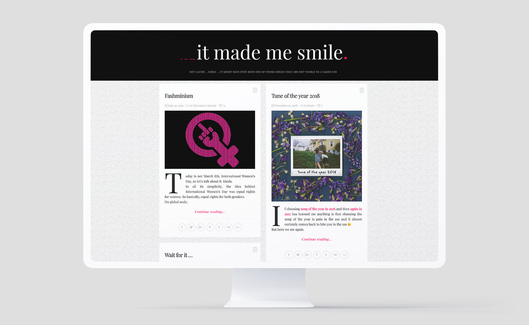
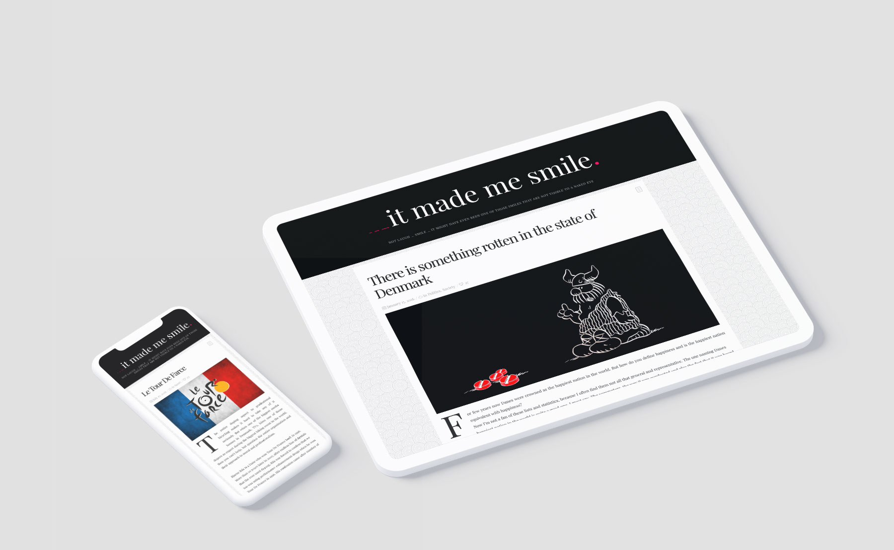
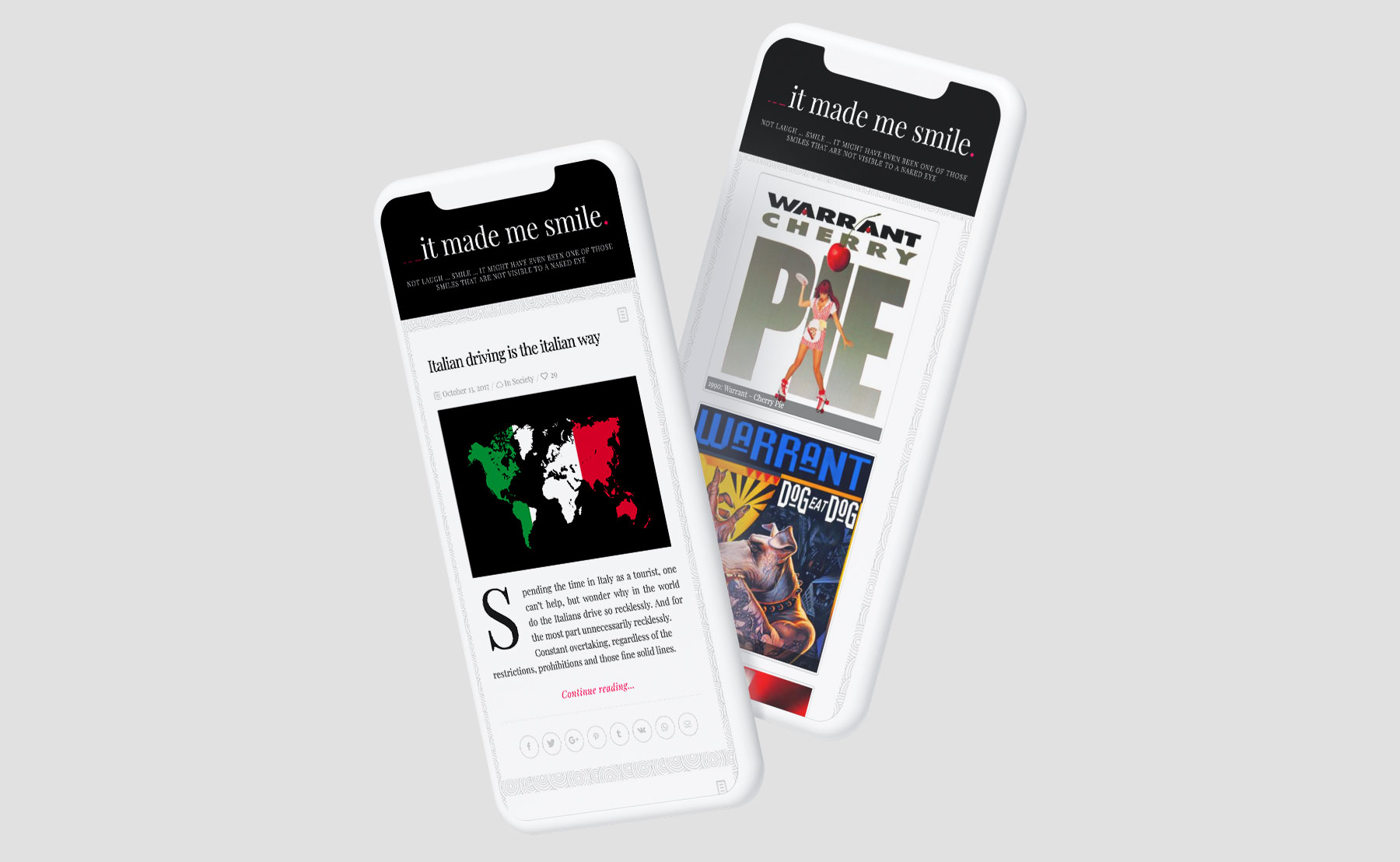
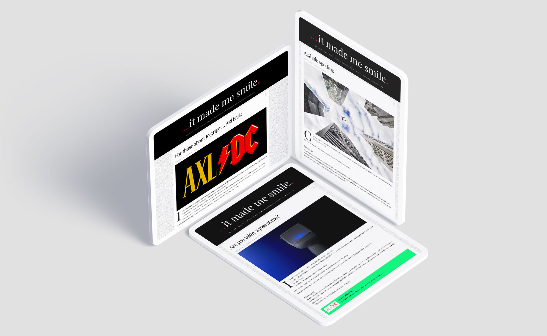
This is a blog with a twist. A blog, which focuses on more than promoting certain brands. The idea was to channel the owner’s thoughts on just about any subject. Therefore the design needed to be simple and user-friendly, but at the same time recognizable.
Many opinions in form of text and picture, with no possibility for readers to interact with the sender. 100% one way communication.
The blog was originally launched in 2014 and now we’ve updated the colour palette to give the layout additional vitality
The blog was originally launched in 2014 and now we’ve updated the colour palette to give the layout additional vitality
Few words about
The logo.
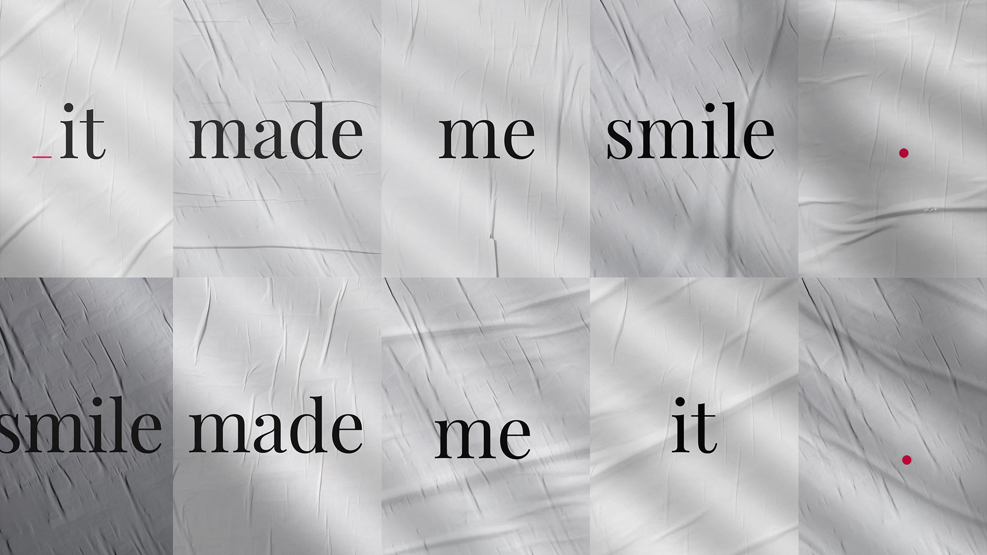
The simple concept behind this blog needed a simple logo. Each post on the blog ends with (para)phrase it made me smile” and this is represented in the logo by the triple dots (…), graphically represented by the lines which are escalating in size. Escalating/developing as the blog post itself.
On the opposite side of the logo the dot (.) represents the fact that the blog is meant as one way communication. There is no possibility for commenting or otherwise communicating with the author. There is possibility to share the articles on social medias, but the dot at the end of the article is in many ways the final dot.
Few words about
The website.
It's special kind of blog so there is no menu, contact possibilities, description, author information or anything else. It's just a extremely stripped down website when it comes to functionality, but also when it comes to design. Few graphical elements give it originality, but other then tat it's a very beck-to-basic- looking website. No bull.

