Few words about
The project.
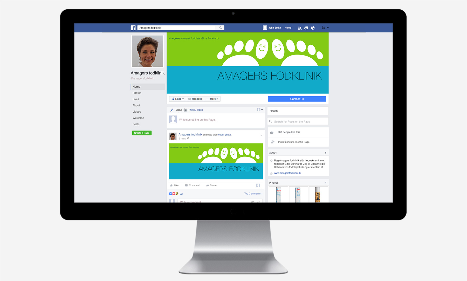
This newly established Amagers Fodklinik was in need of complete setup so we were hired to create a visual ID, website and Facebook presence for this Copenhagen based foot clinic.
We've worked closely with the owner in order to create a result that represented the clinic fully. It needed to be clean and elegant, but at the same time down-to-earth and neighbourly, rather than coming across as too luxurious and status driven.
Few words about
The logo and print.
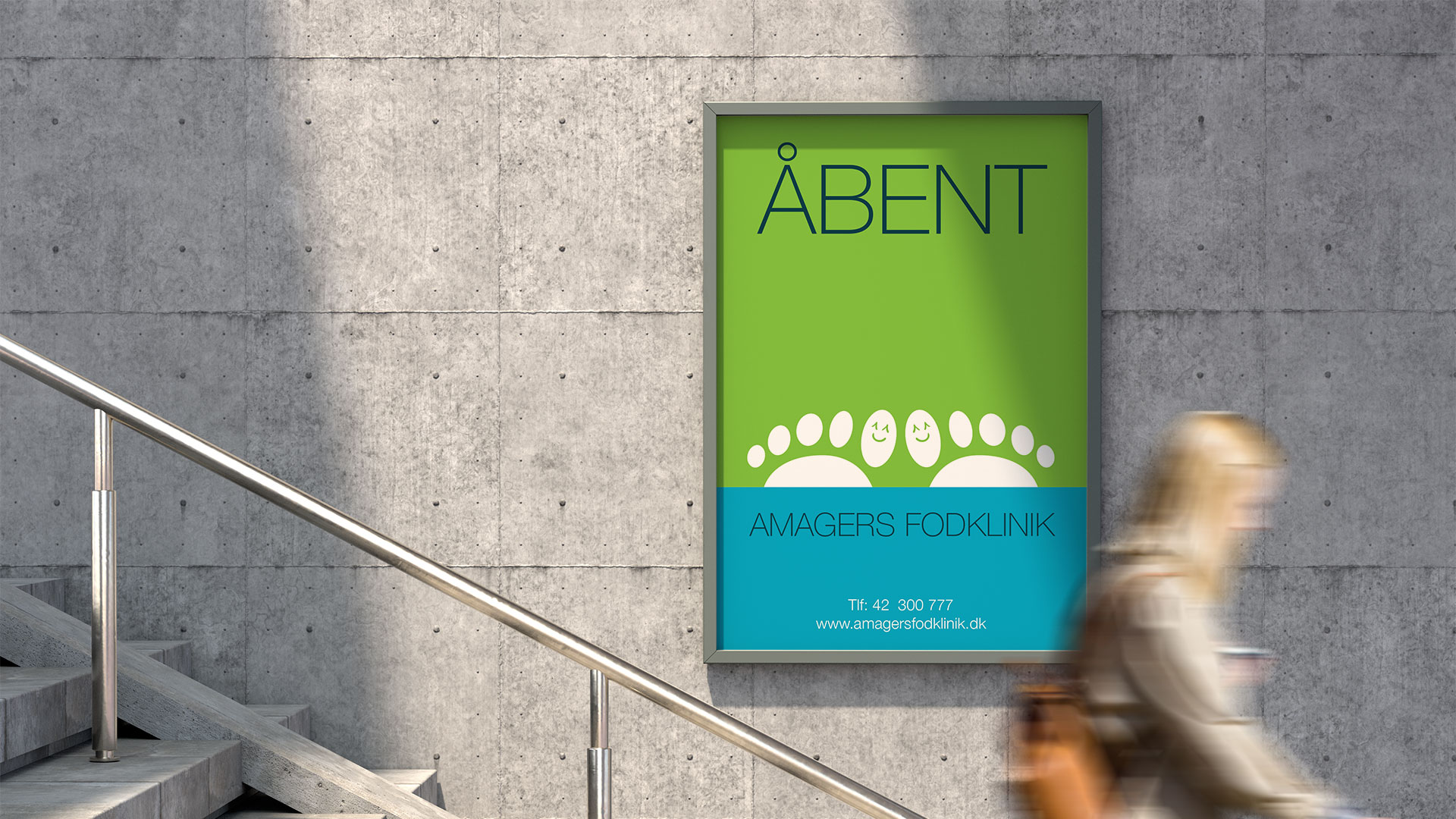
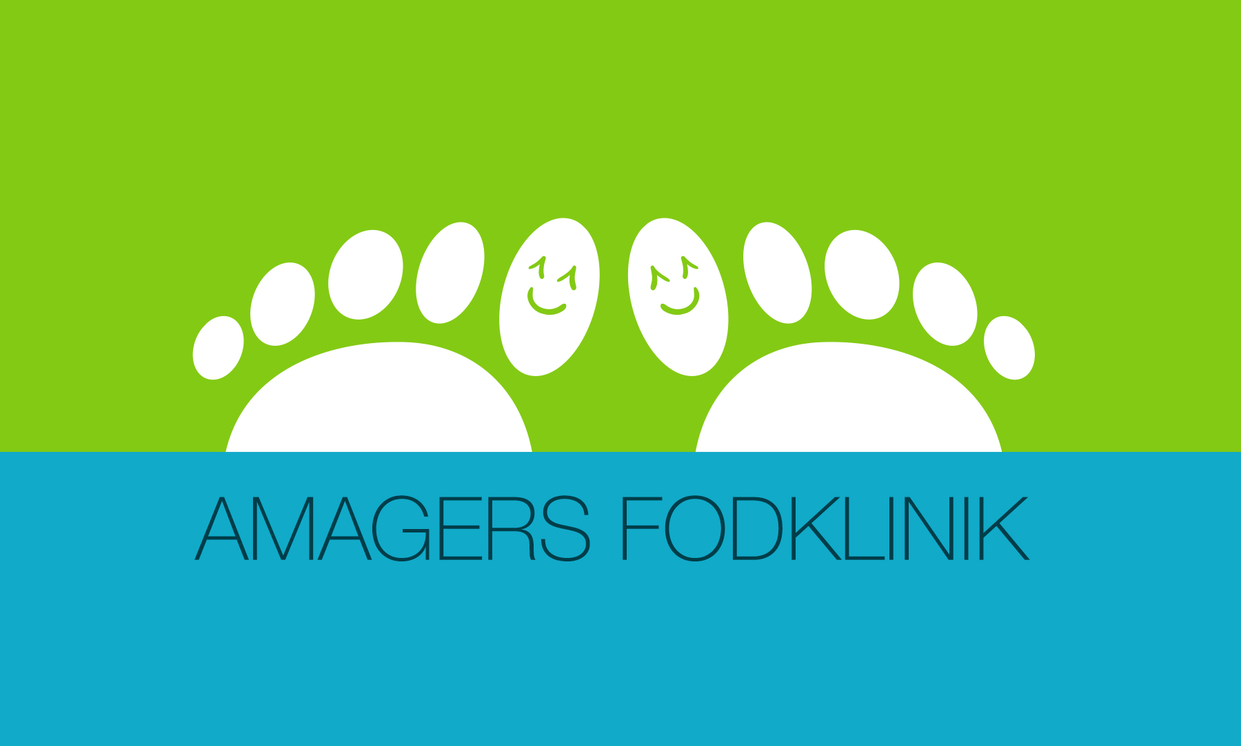
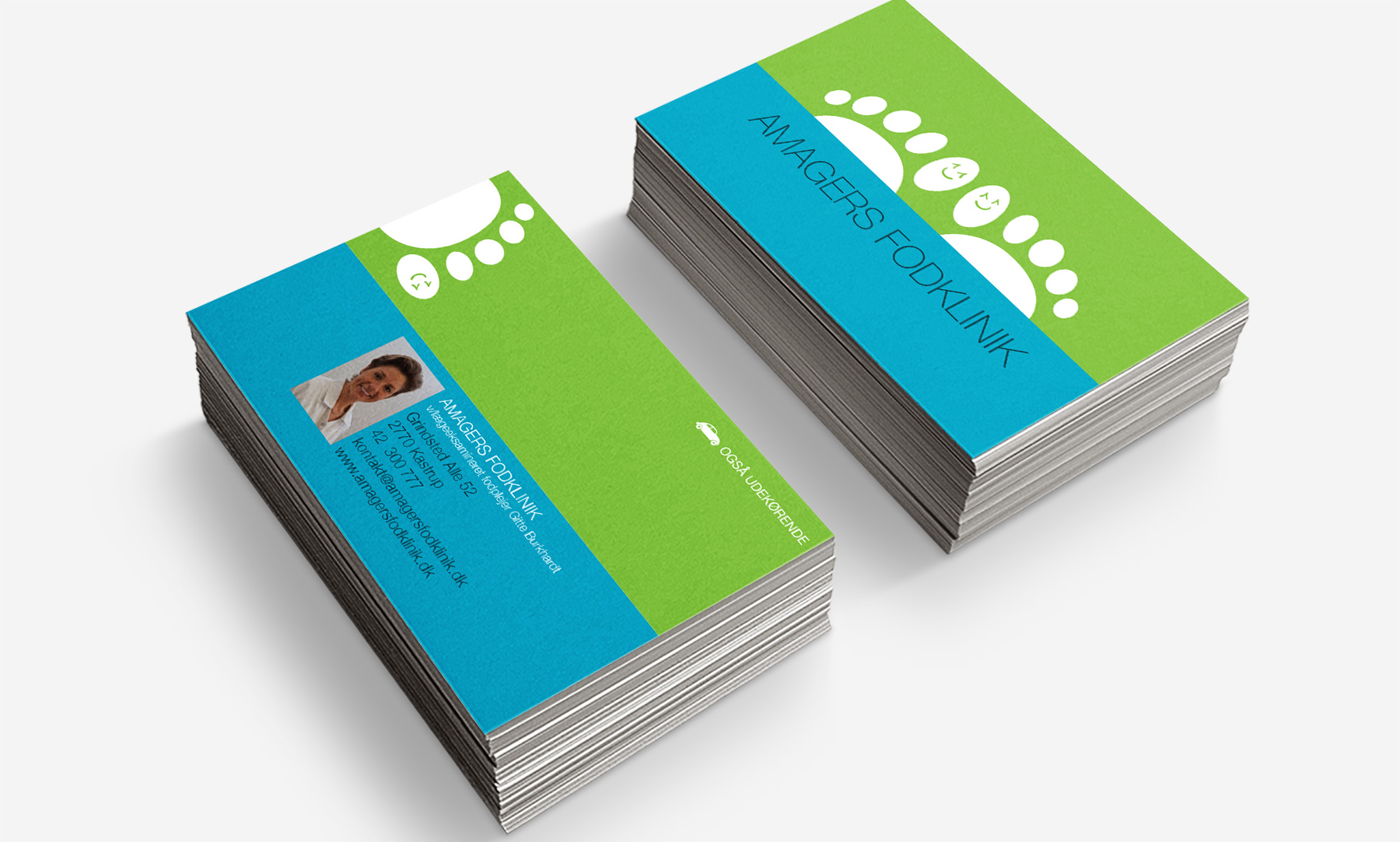
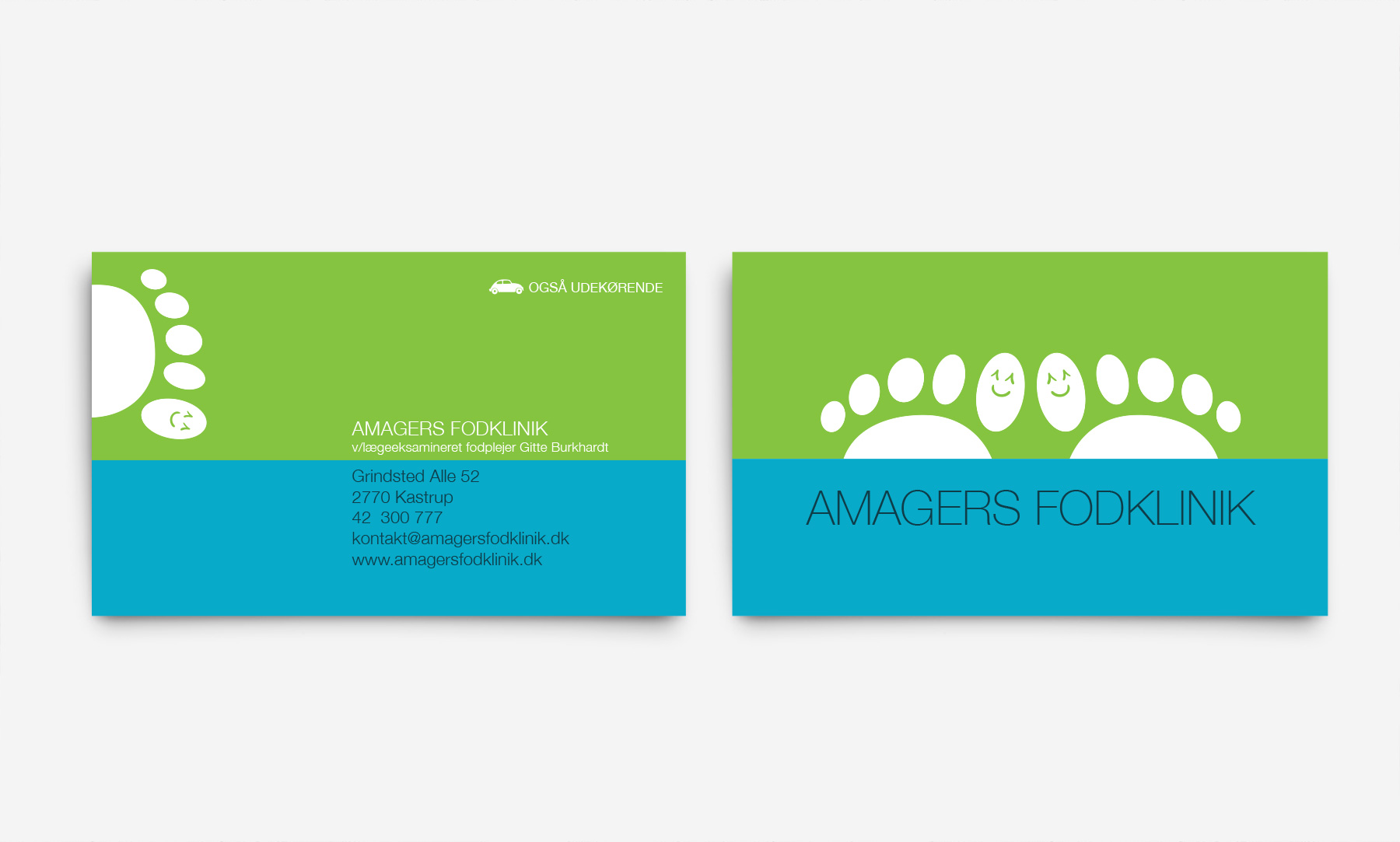
Based on the overall idea of neighbourly elegance we've created a logo that breathes just that. Fresh colours and descriptive yet jolly graphics that underline the core values of Amagers Fodklinik.
Once the visual ID was in place we've used it as a fundament for all the following aspects of this project. The print aspect includes business cards, gift cards, flyers and posters.
Few words about
The website.
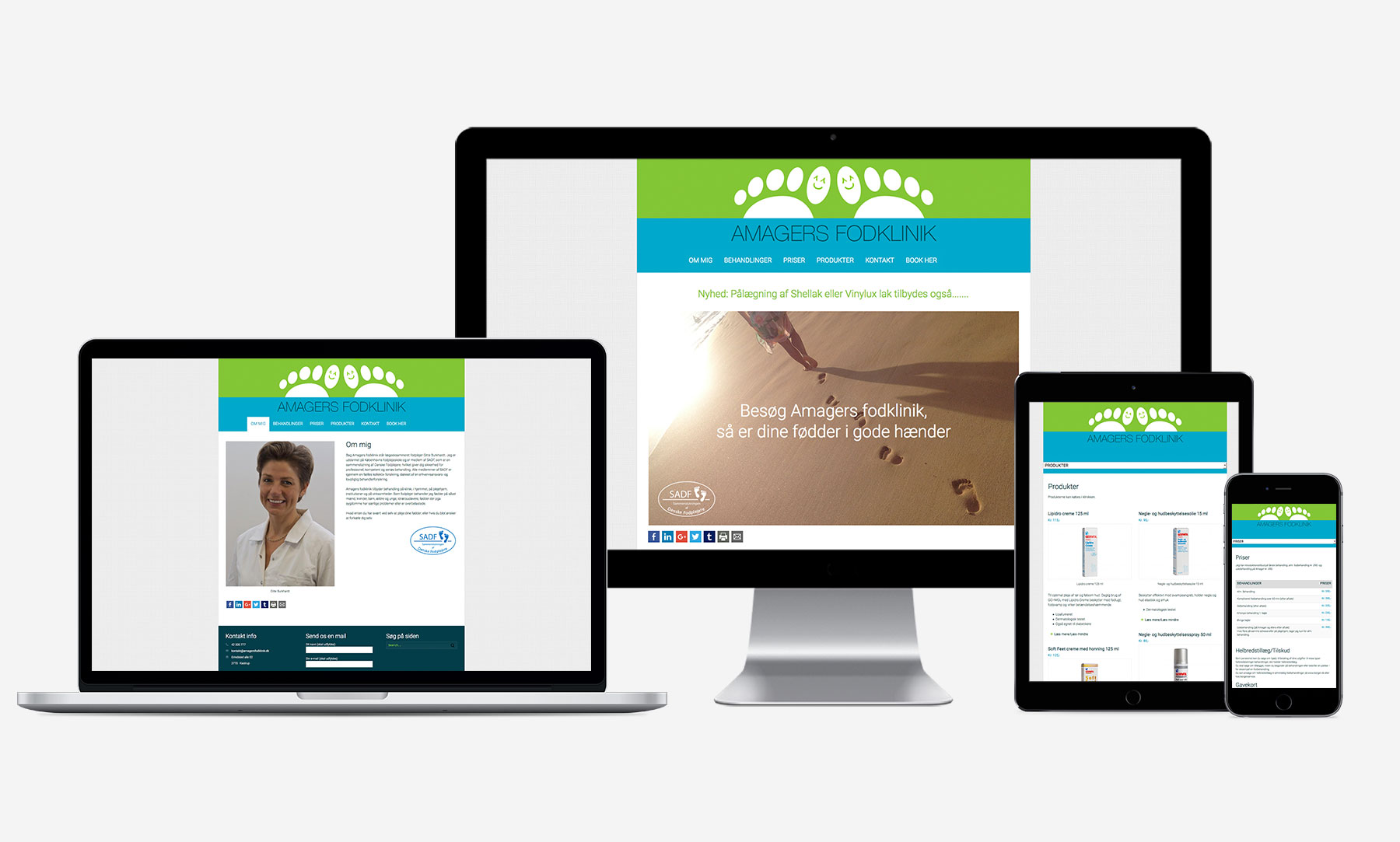
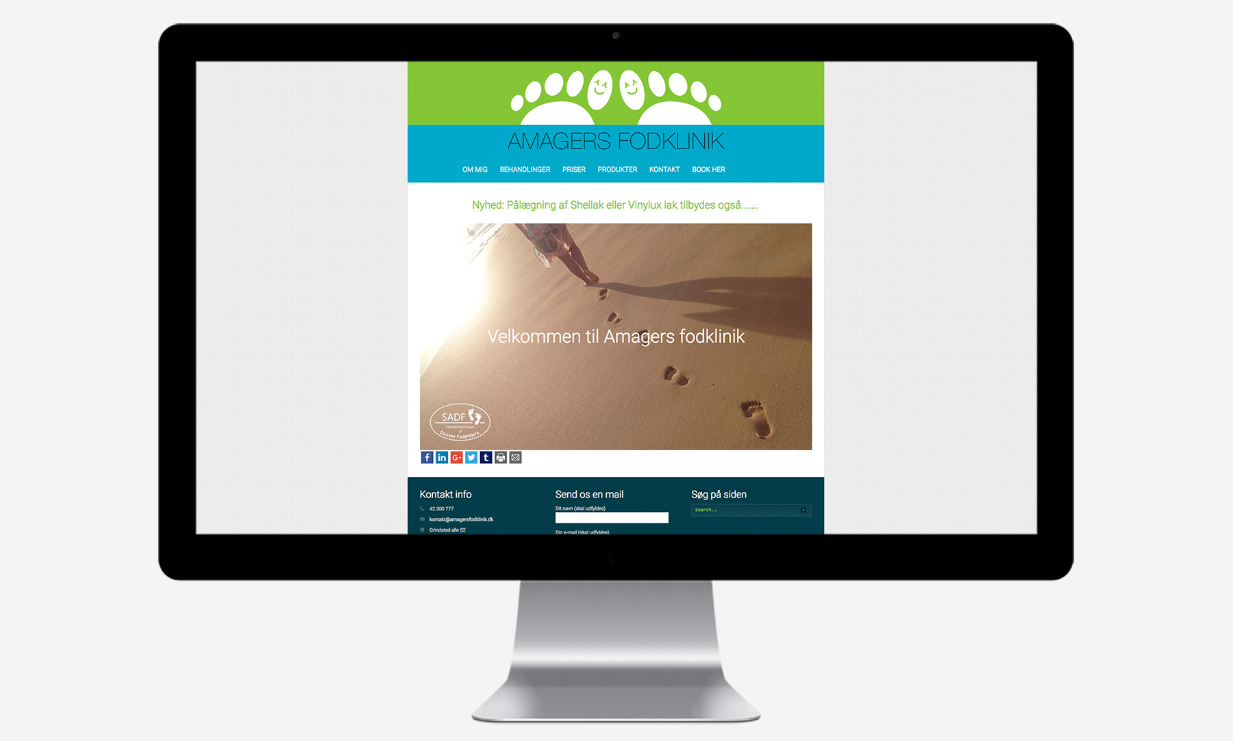
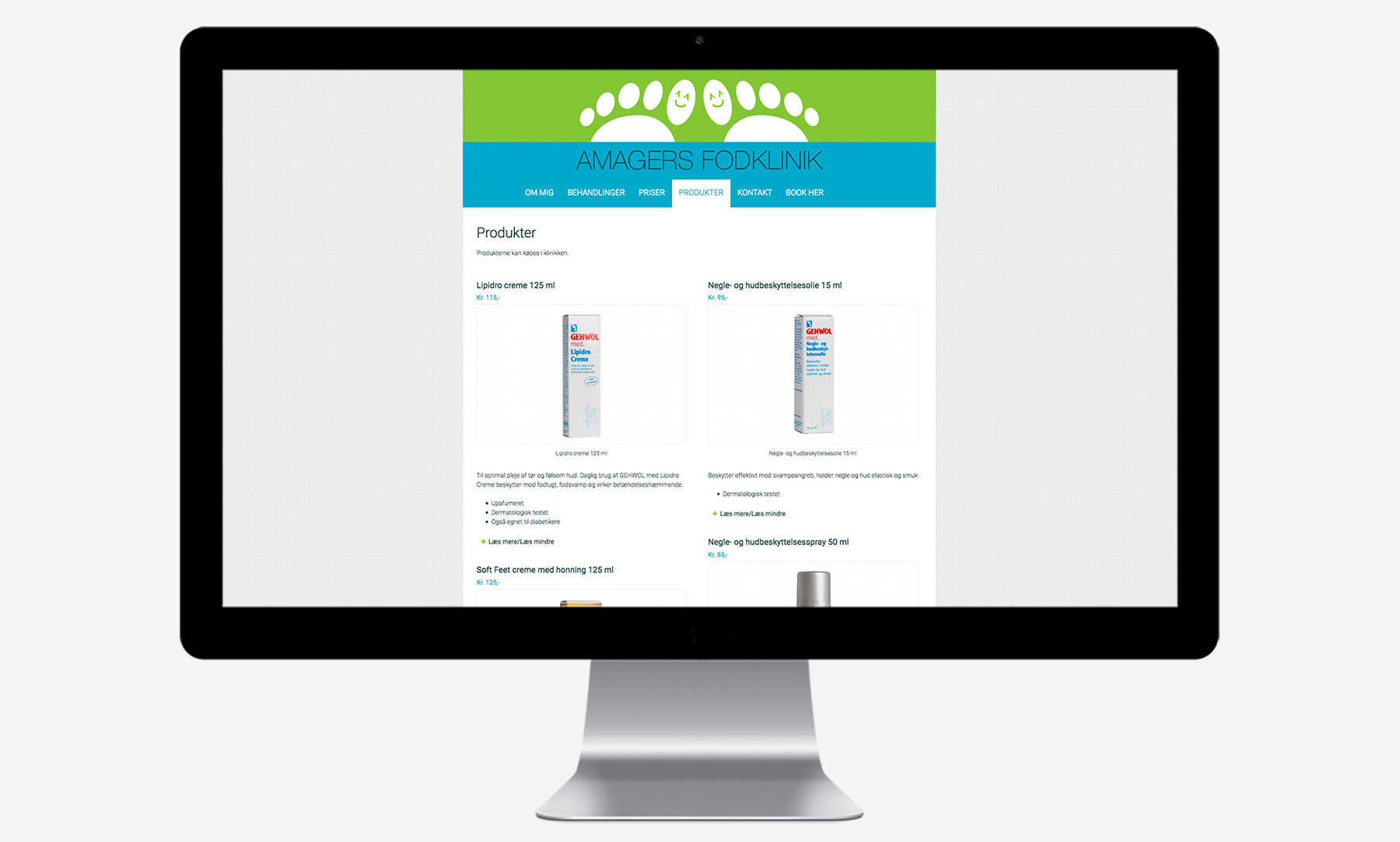
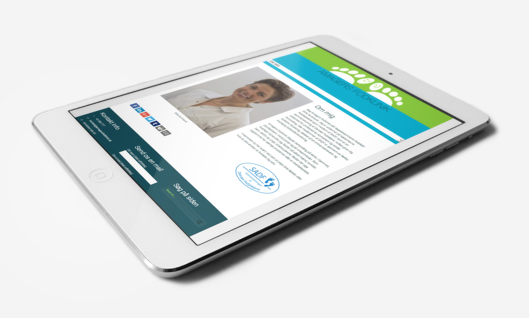
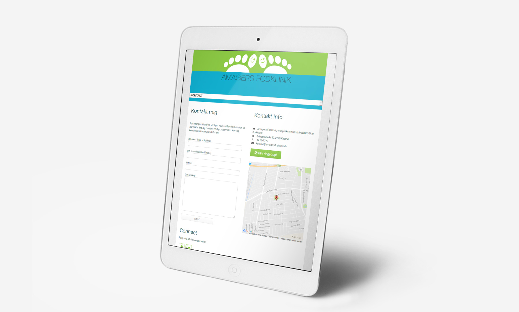
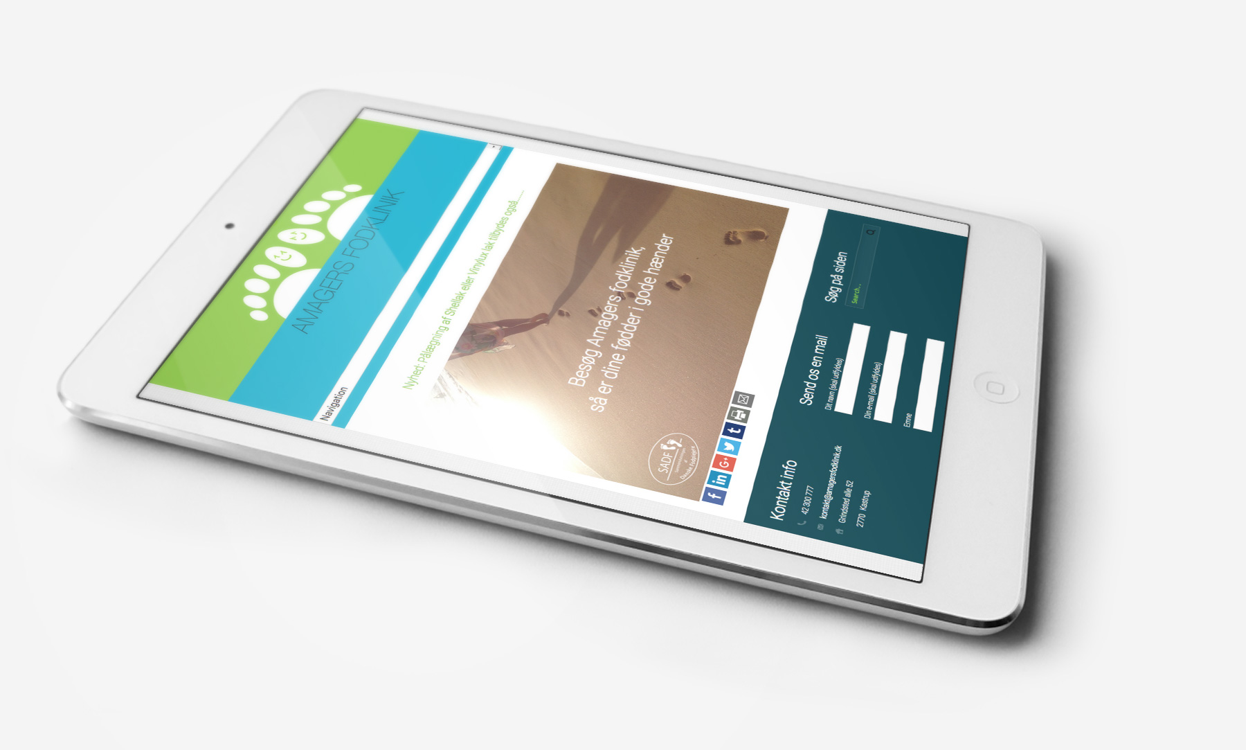
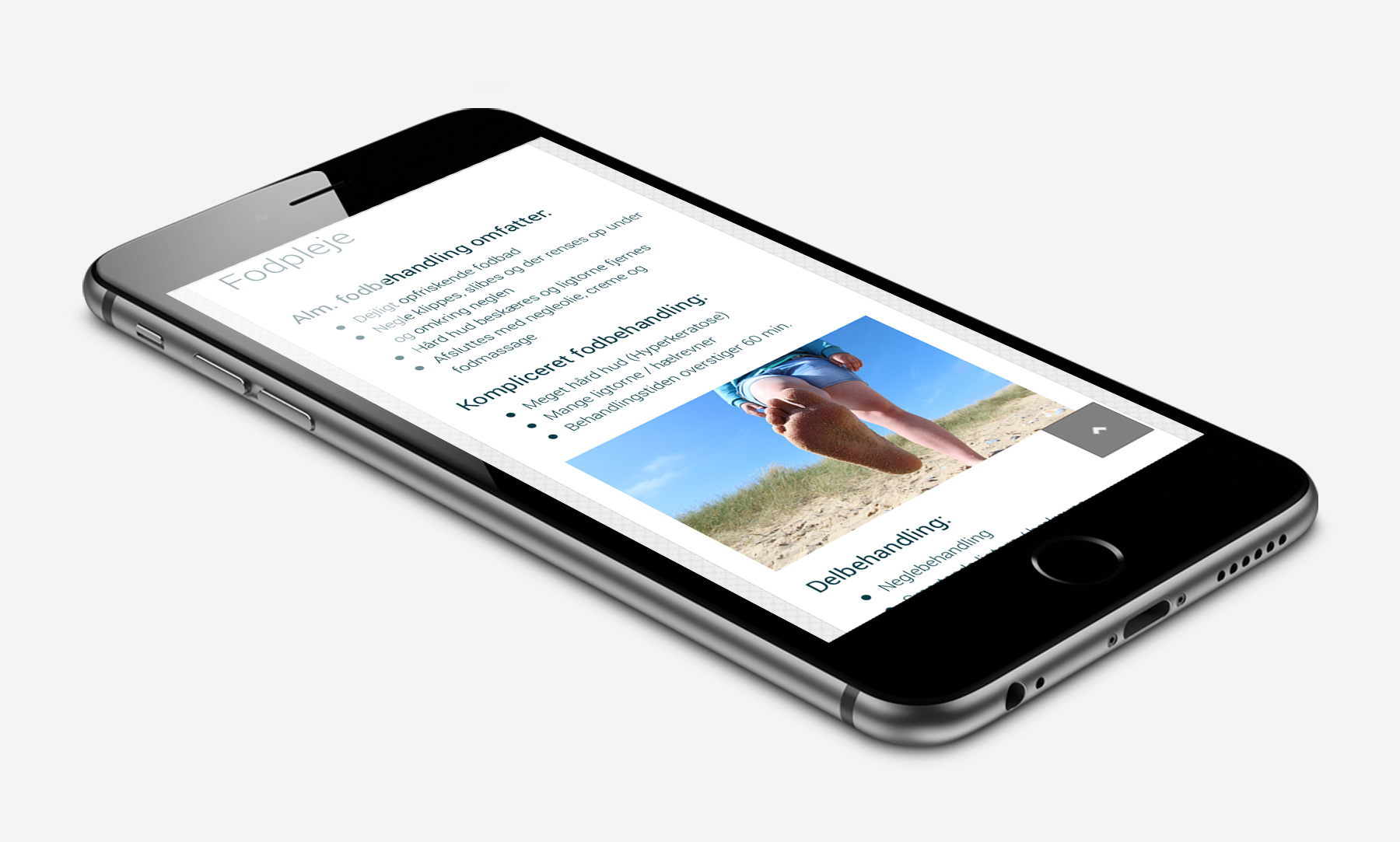
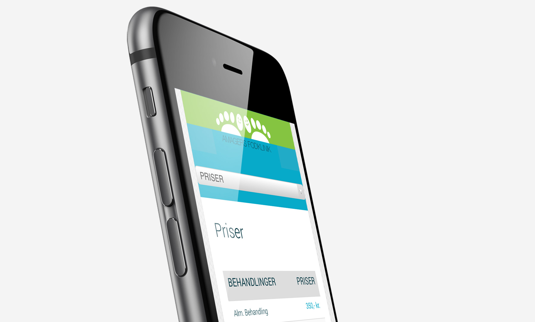
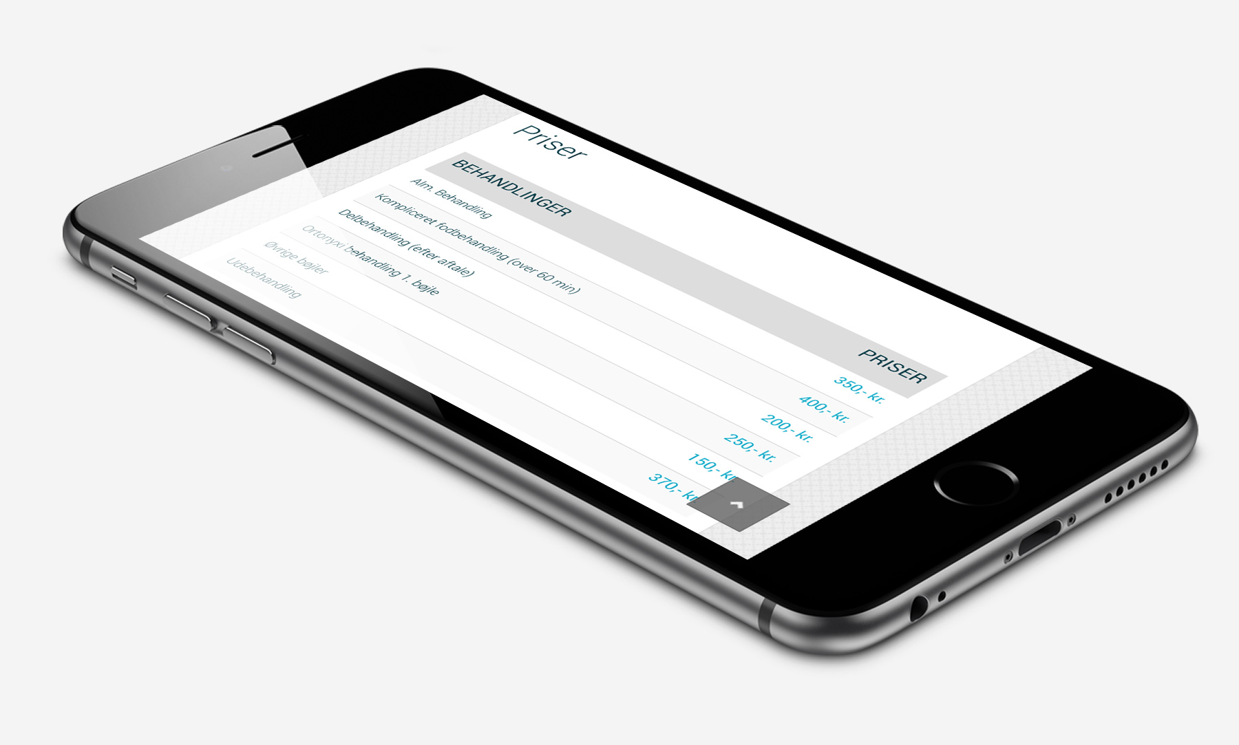
Simply simple, clean and elegant – his site had to fulfill all these three criteria and not only when it comes to layout, but none the less navigation on the site. While designing the site it was important to be able to find whatever needed in matter of few seconds – regardless where on the site the user is. So go ahead, try it out yourself and you’ll see that we’ve achieved this goal.

