UrbanMescalero Photography
Logo + website
www.urbanmescalero.com
Few words about
The project.
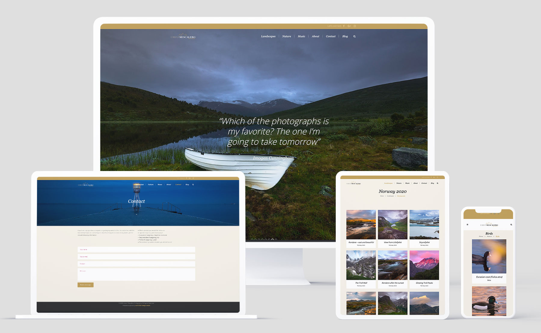
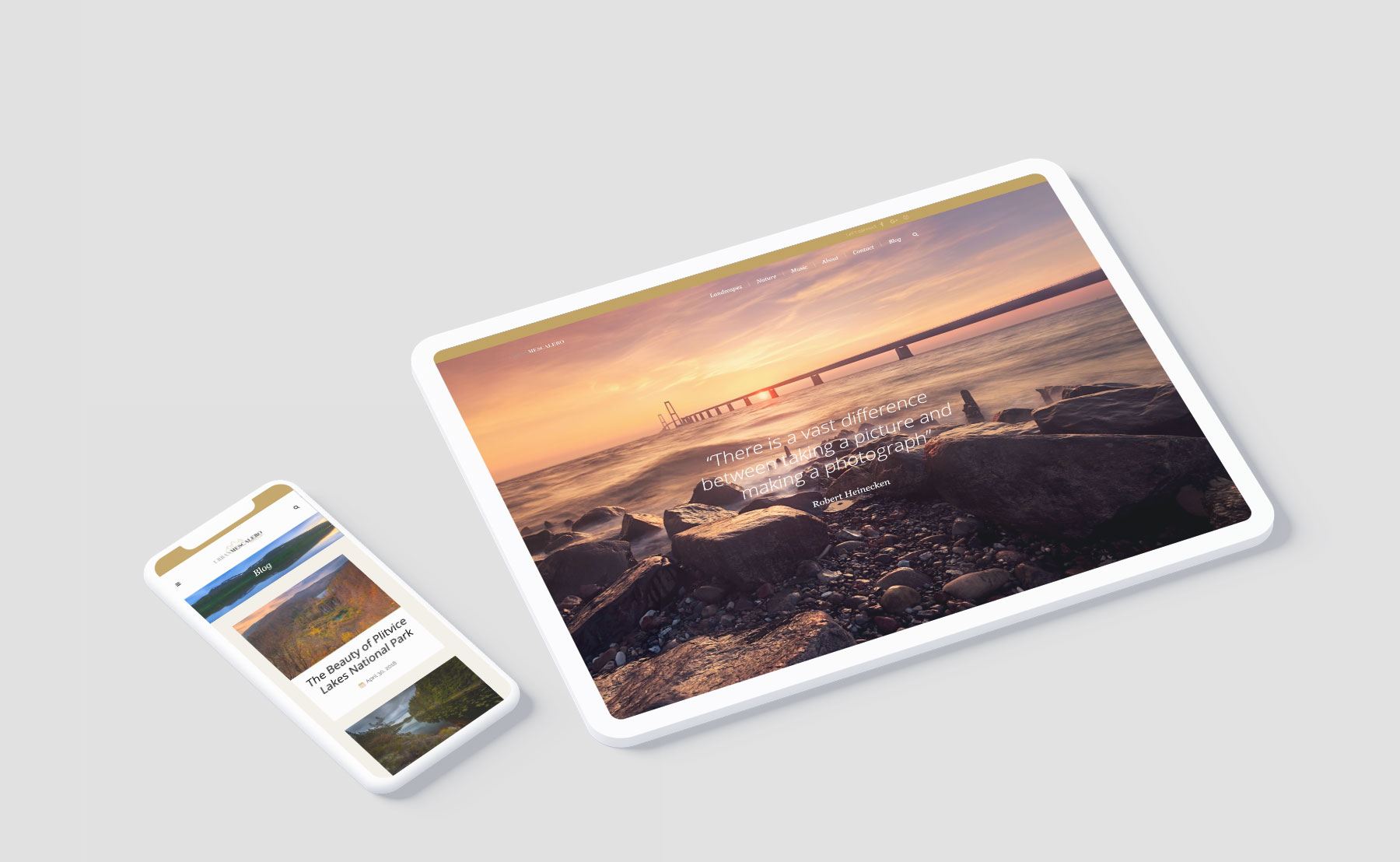
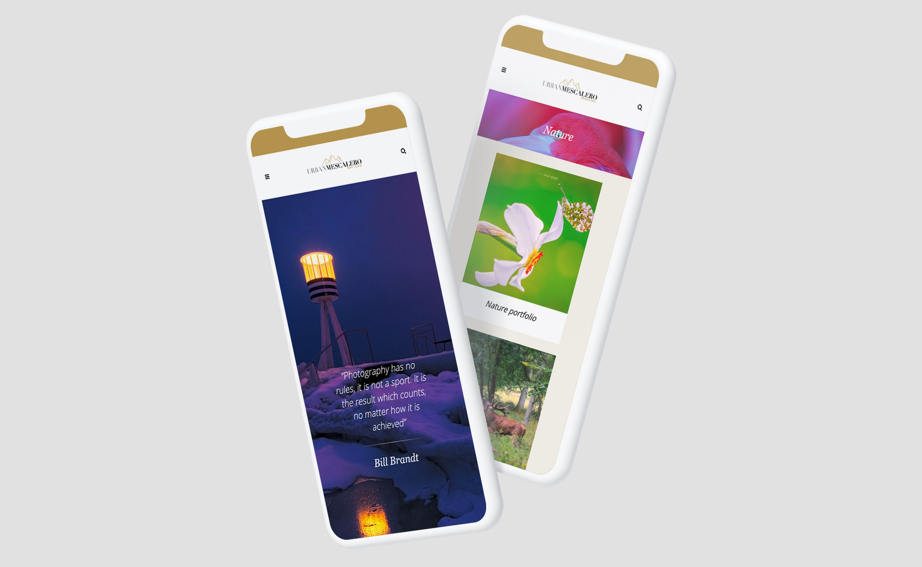
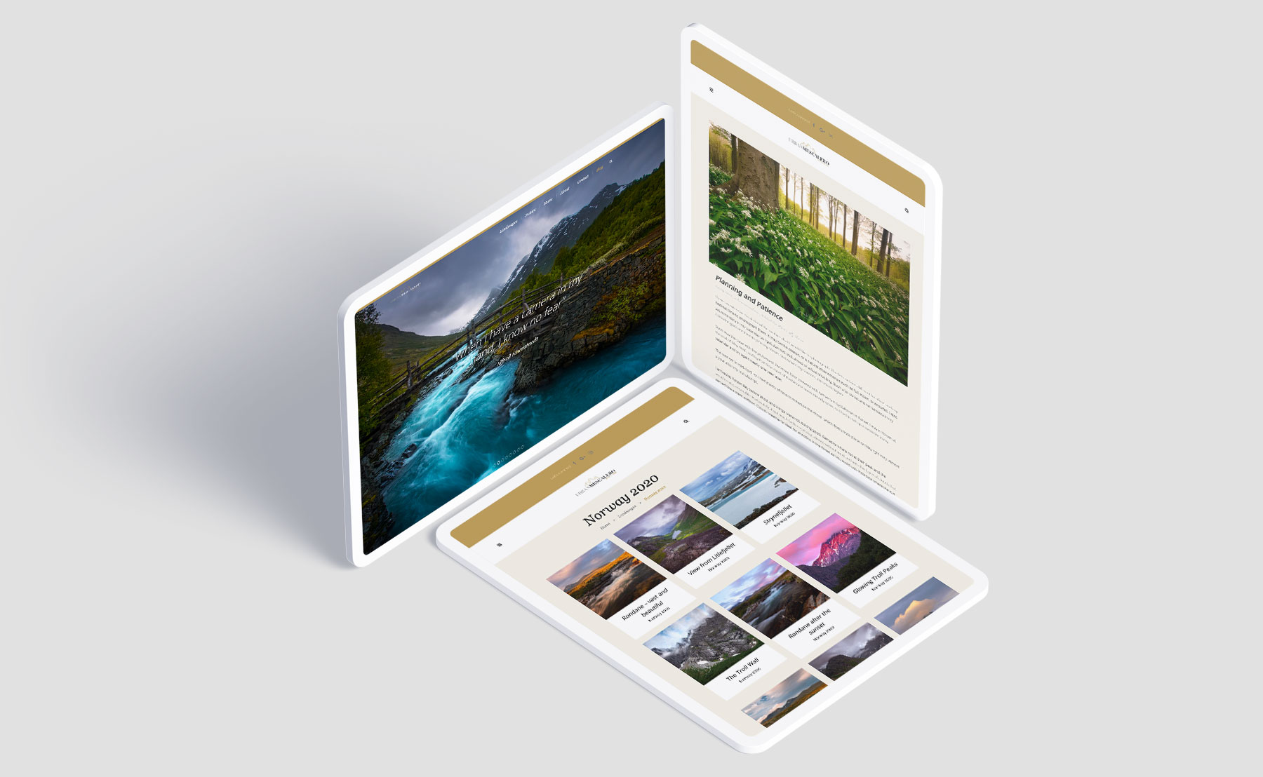
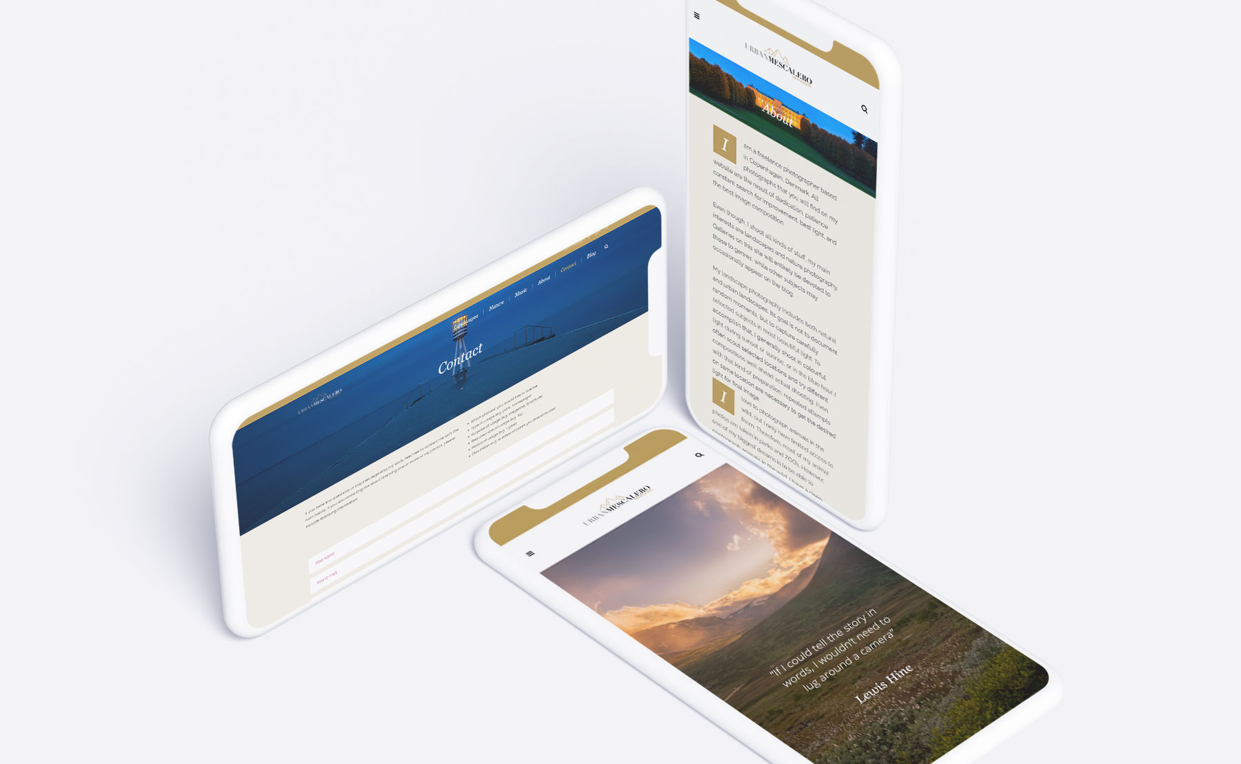
We’ve created a full Visual ID and brand new responsive website for this Copenhagen photographer and a longtime client. This is the third website we’ve done for UrbanMescalero Photography over the years.
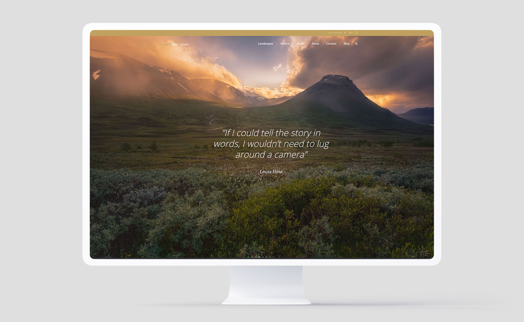
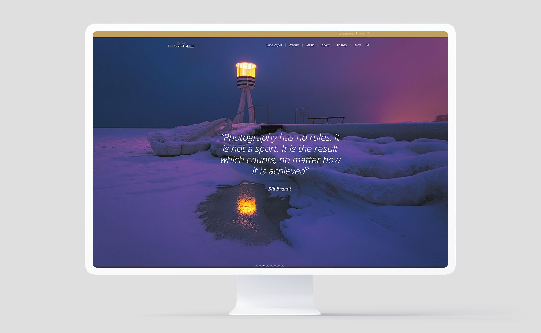
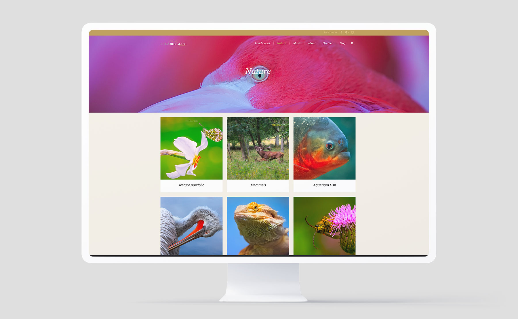
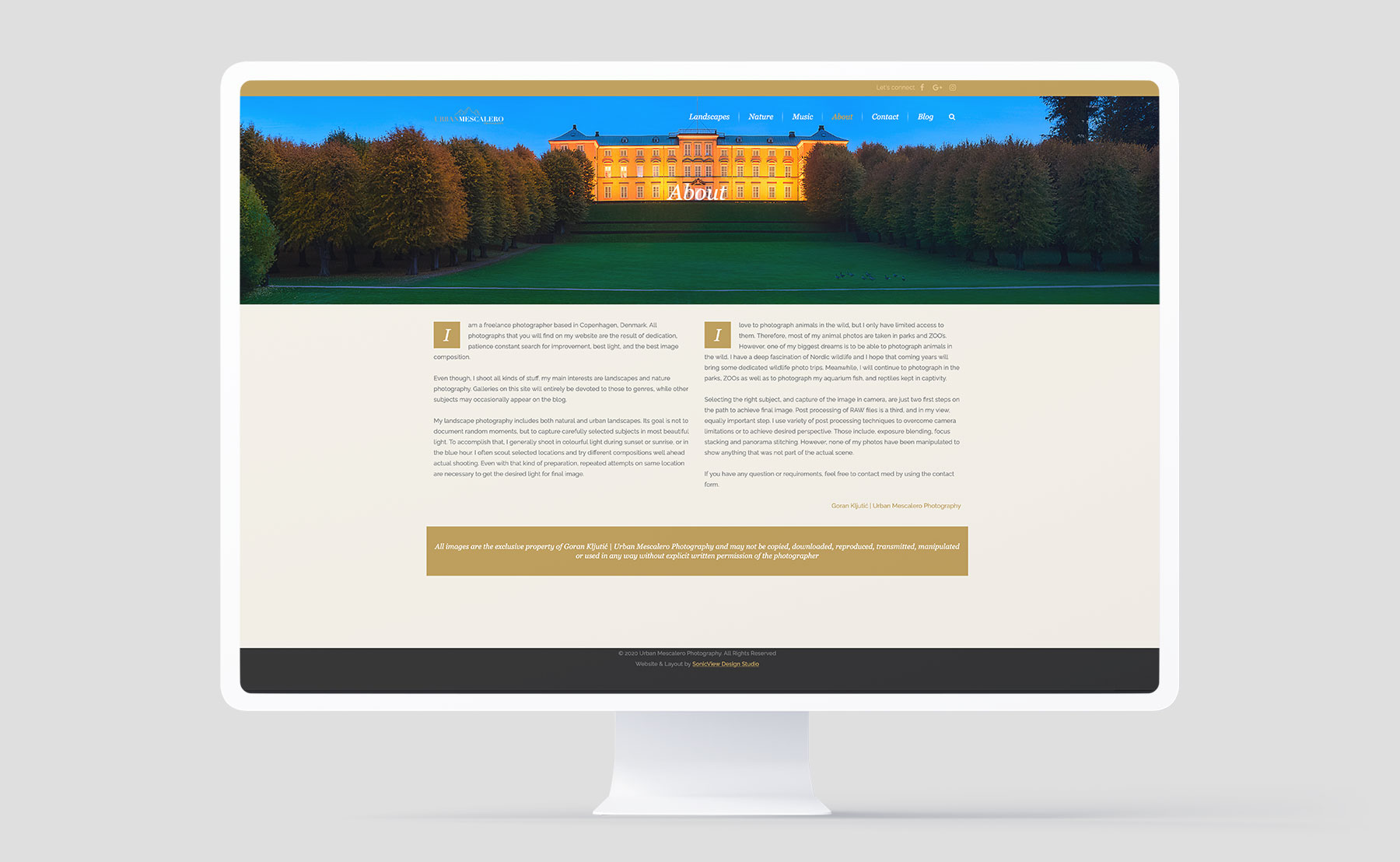
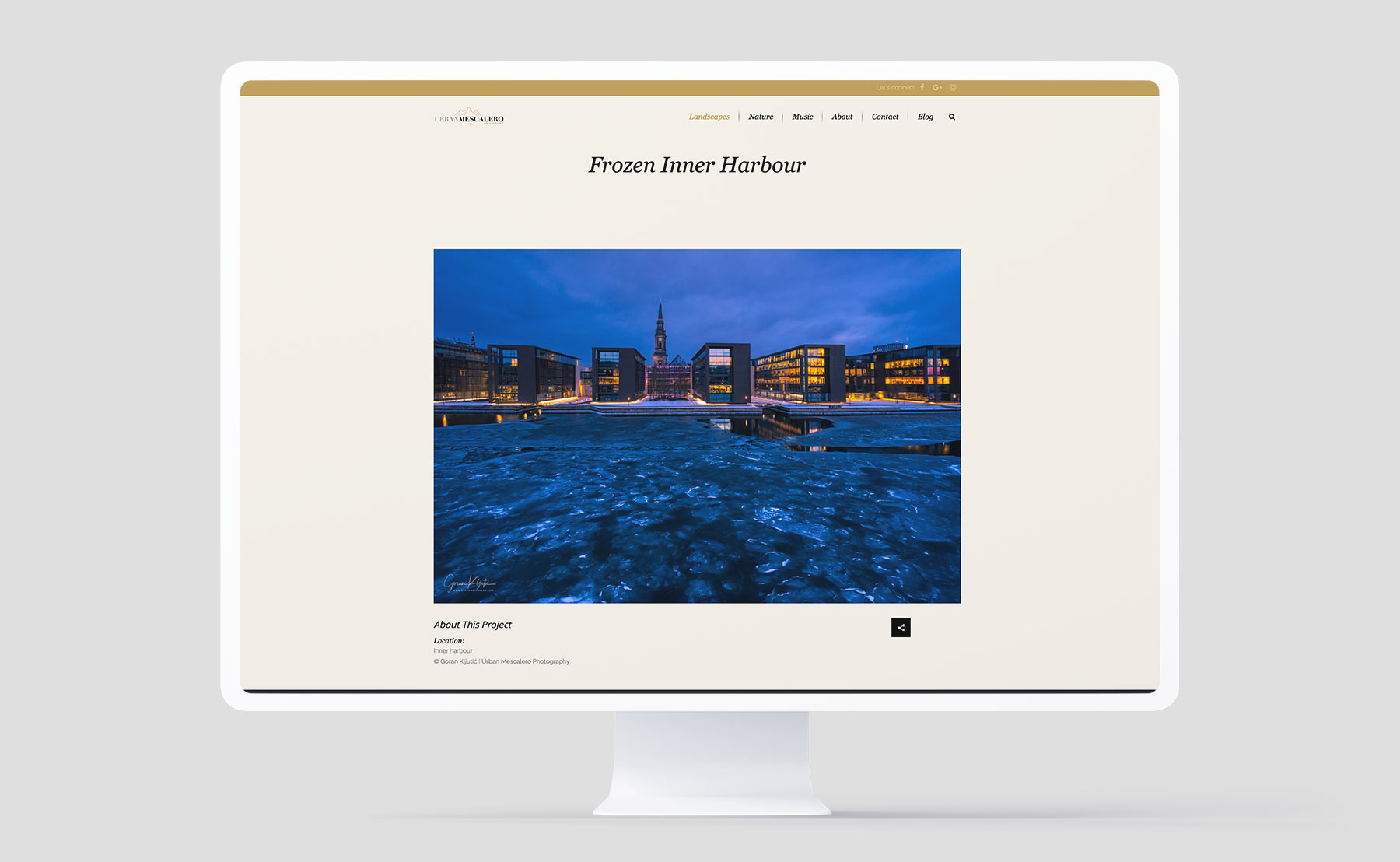
The visual expression for this client is extremely simply in order not to take any focus from the pictures, which are most important aspect of the entire experience.
The visual expression for this client is extremely simply in order not to take any focus from the pictures, which are most important aspect of the entire experience.
UrbanMescalero is a collection fine art images by Copenhagen based photographer. They are all are product of patience, dedication, and ever going chase for the perfect light and strongest possible composition. Do yourself a favor and browse through the many interesting galleries on this website.
Few words about
The logo.
Elegance and nature were keywords for this project and as a central element in the visual ID, the logo had to represent it flawlessly.
We decided not to go with typical "nature colours" - despite the current rage over the green colour.
We decided not to go with typical "nature colours" - despite the current rage over the green colour.
Instead we used fairly neutral colors and fonts.
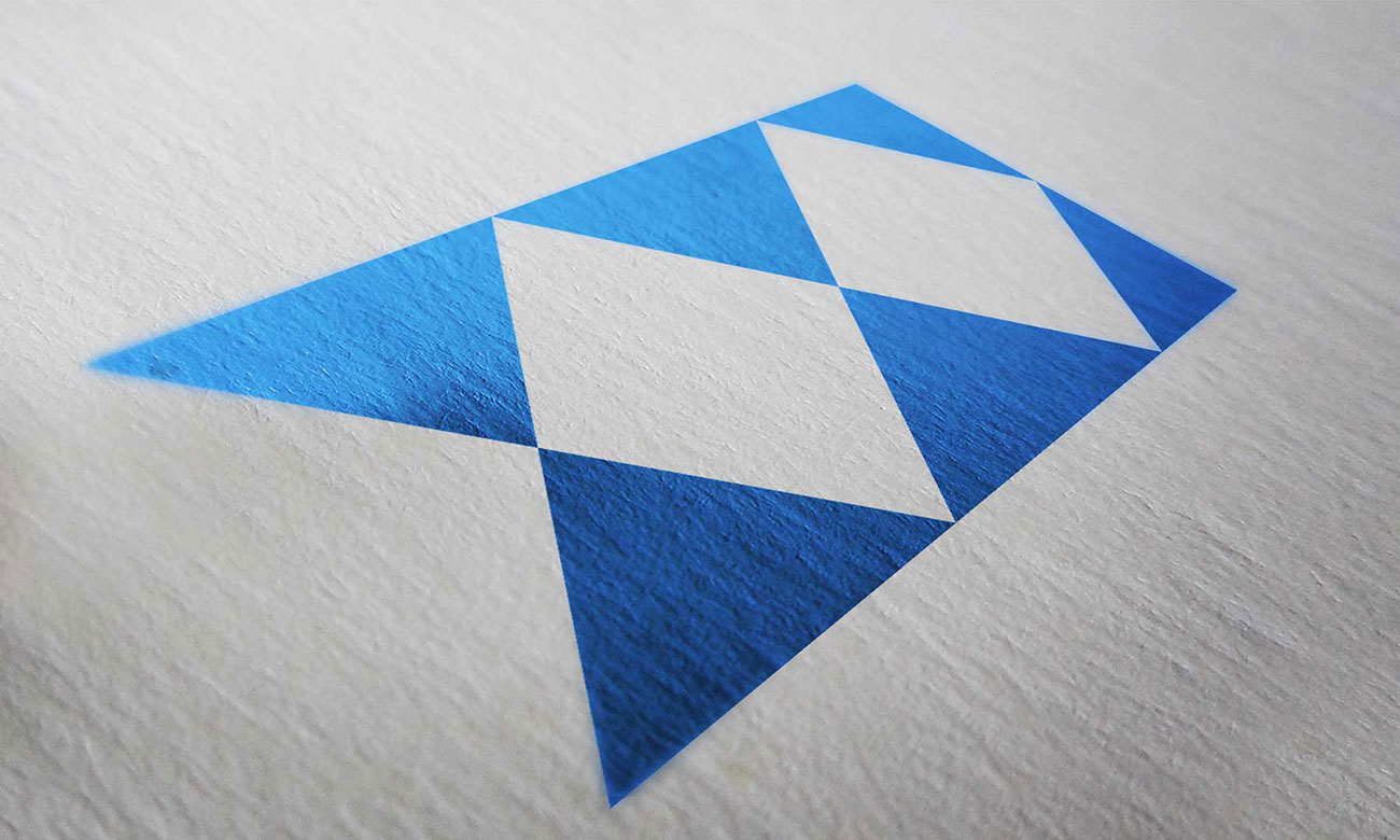
The logo has a timeless feel to it and its simplicity speaks volumes. Its stamp quality also works well as a watermark on the images themselves, which was one of the requirements as well.
The logo has a timeless feel to it and its simplicity speaks volumes. Its stamp quality also works well as a watermark on the images themselves, which was one of the requirements as well.
Few words about
The website.
Simplicity and elegance are key-terms for this website where, much like at the museum, the environment’s role is often that of creating a setting that is comfortable but at the same time serves only as a frame for the most important aspects, the pictures.

