21 Juni
Visual ID + website
www.21juni.dk
Few words about
The project.
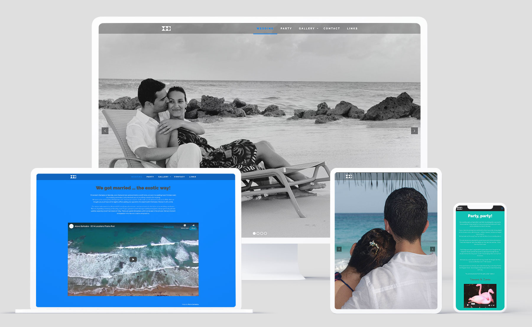
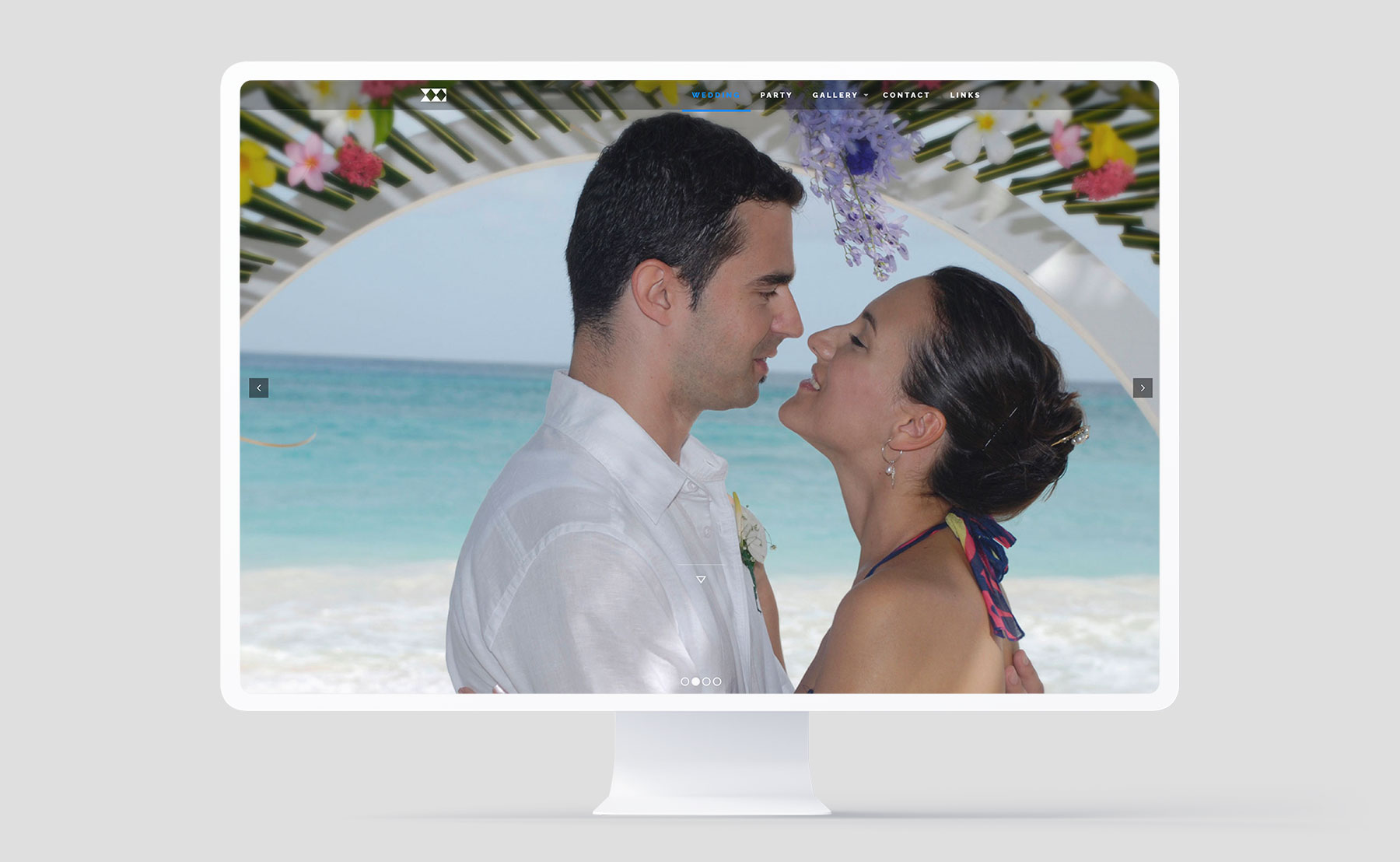
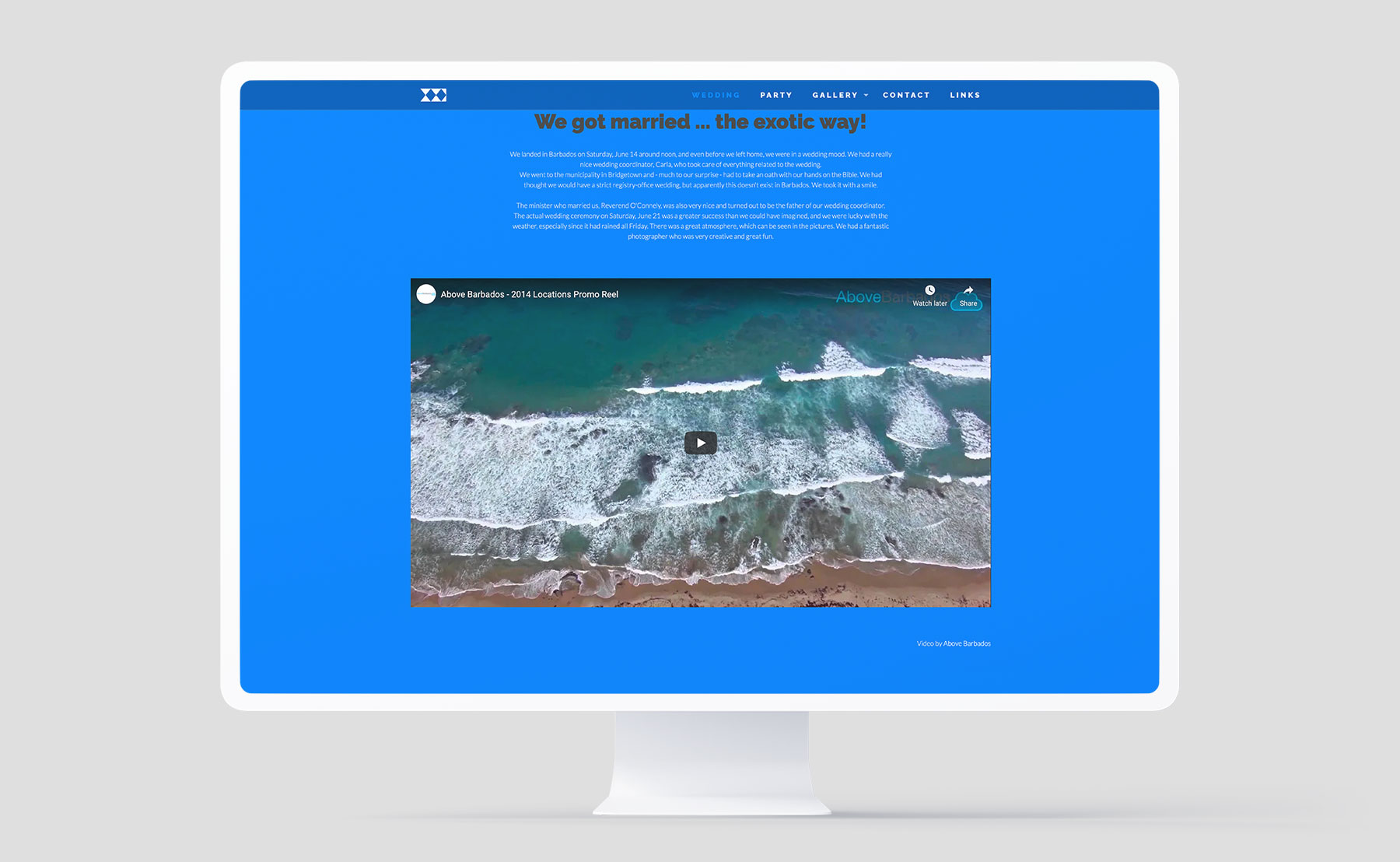
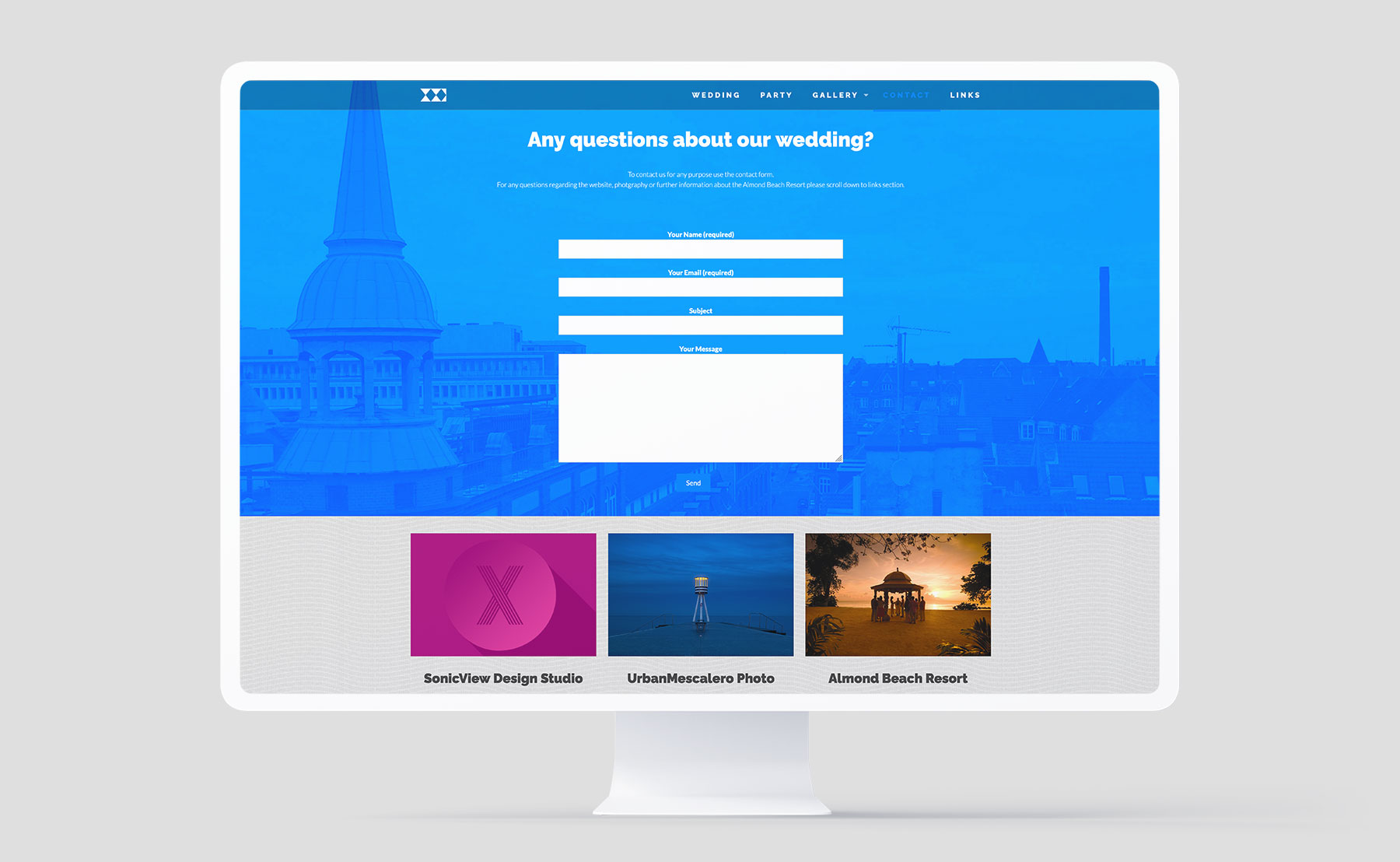
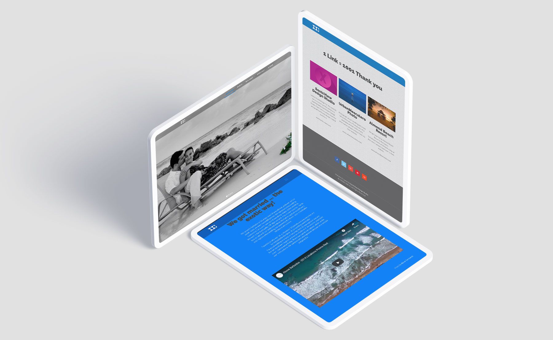
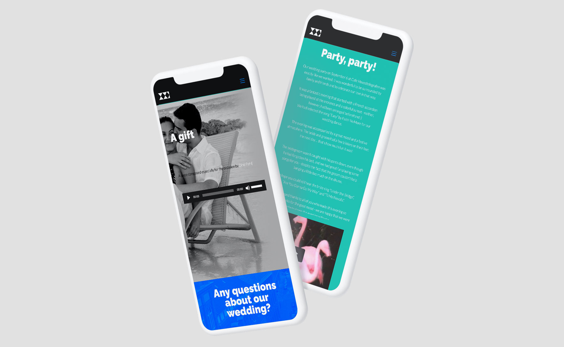
We were hired to do create everything for this wedding website. The site needed to be easy to use because its main purpose is informative. At the time it was important that visitors would get the impression of the environment in which the wedding took place, because there were not present at this intimate wedding.
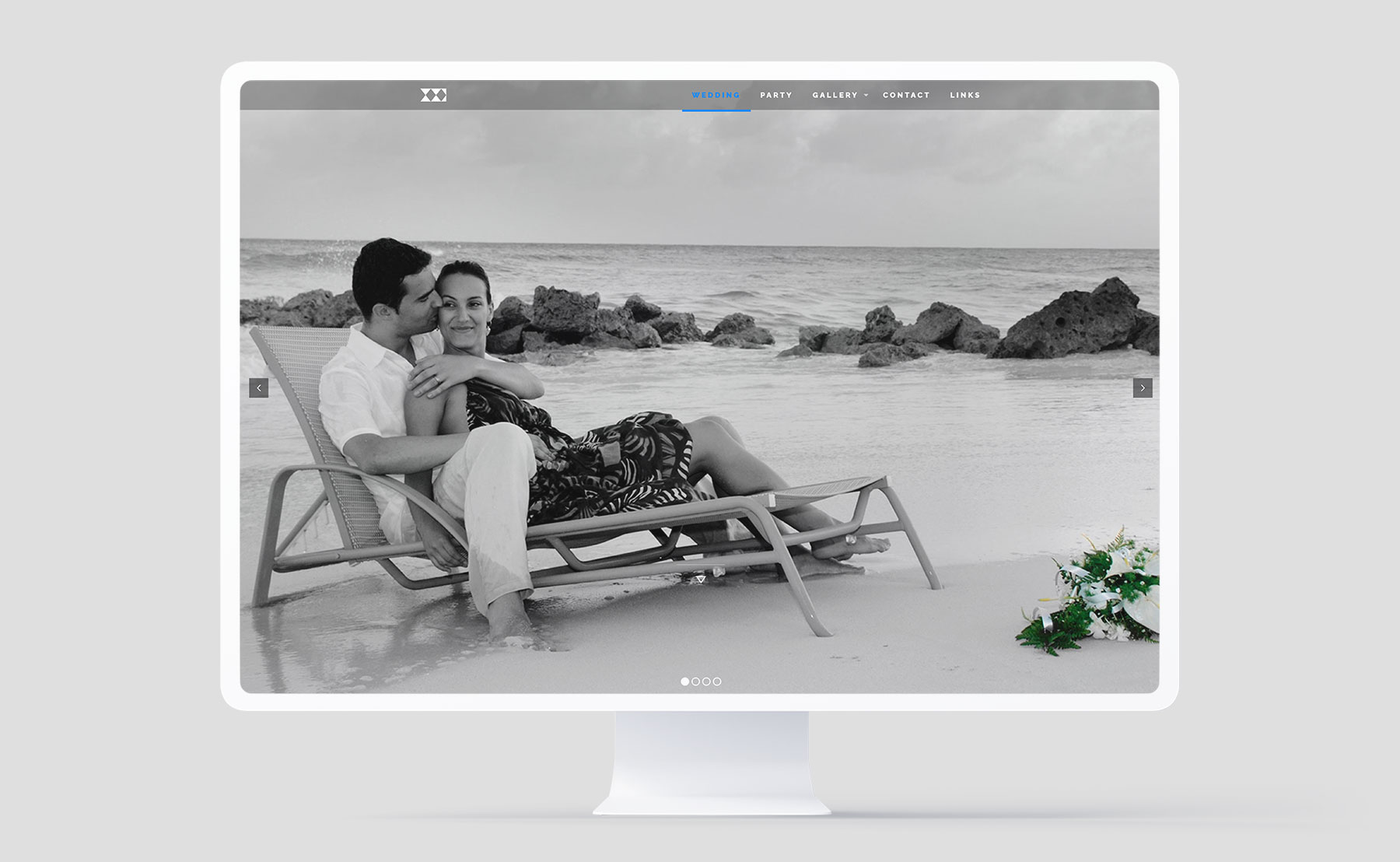
The wedding took place in Caribbean we wanted to present this by a specific color-plate that was a parallel to the Caribbean, without literally reflected a specific part of the world. At the same time Scandinavia which is clients' base needed to play a role as well. The background image sets the mood perfectly and makes the visitors want to press on gallery to see more images.
Few words about
The logo.
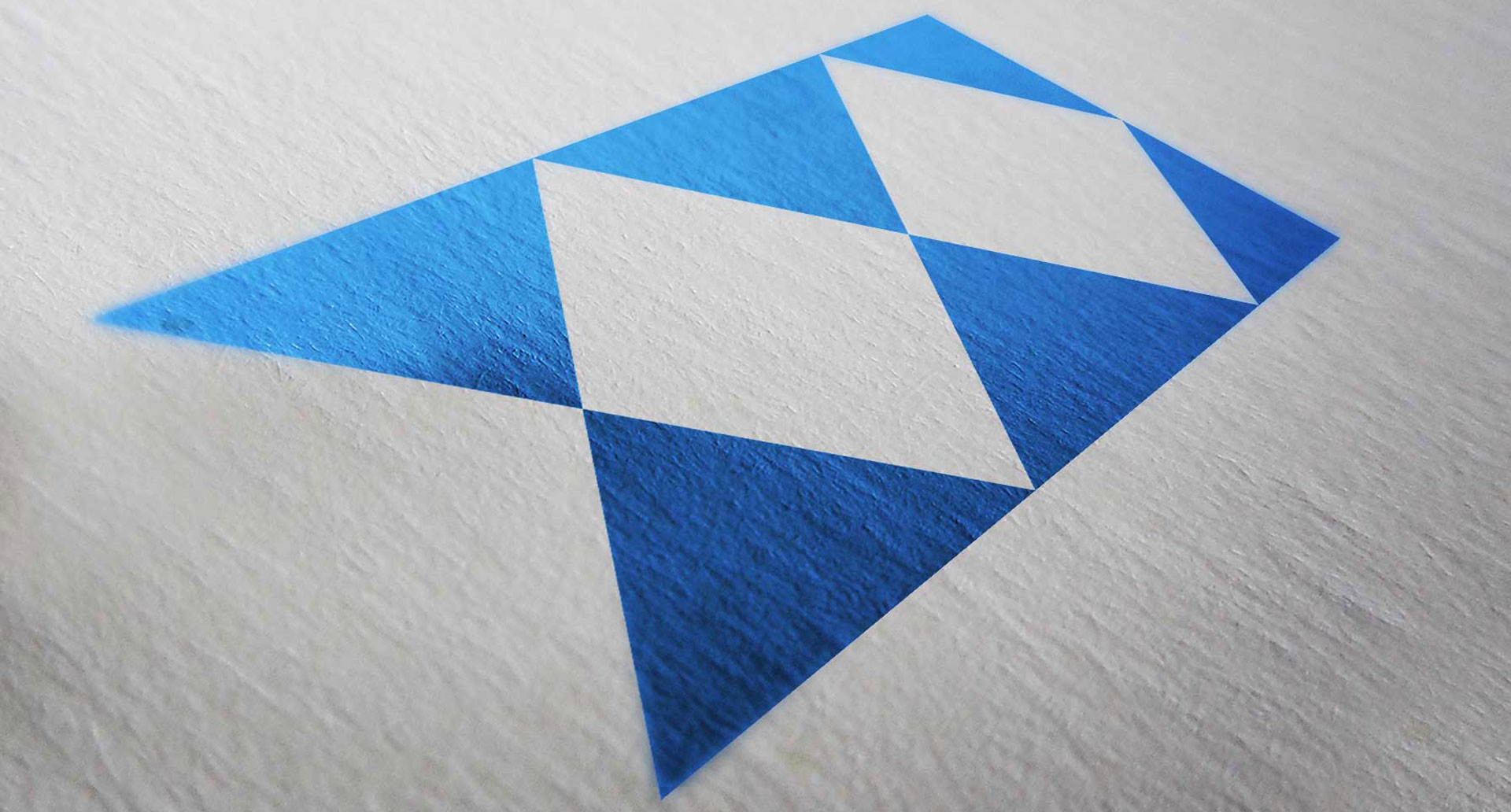
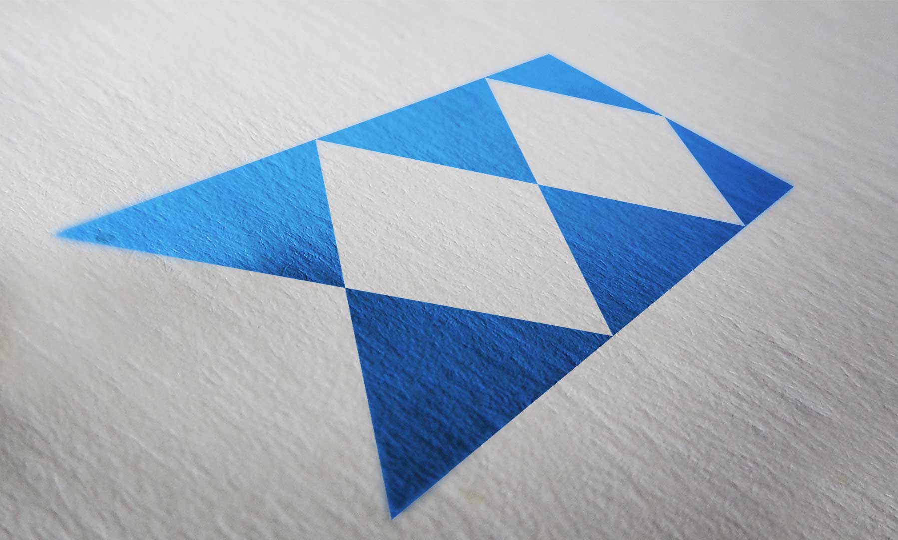
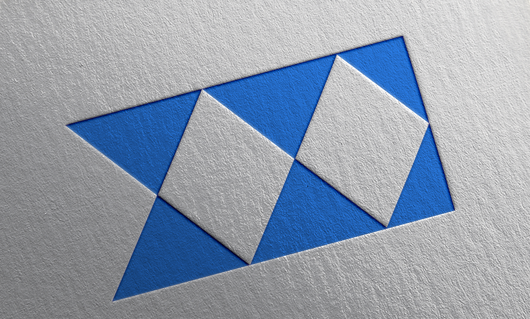
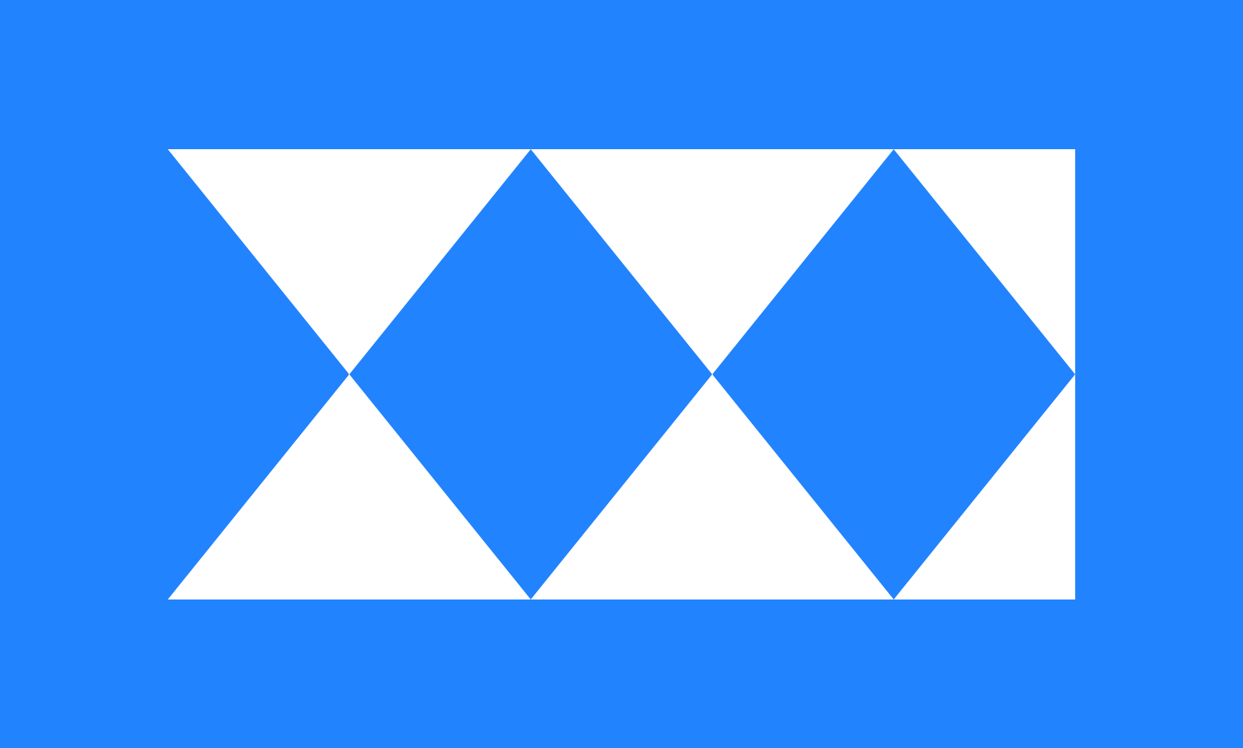
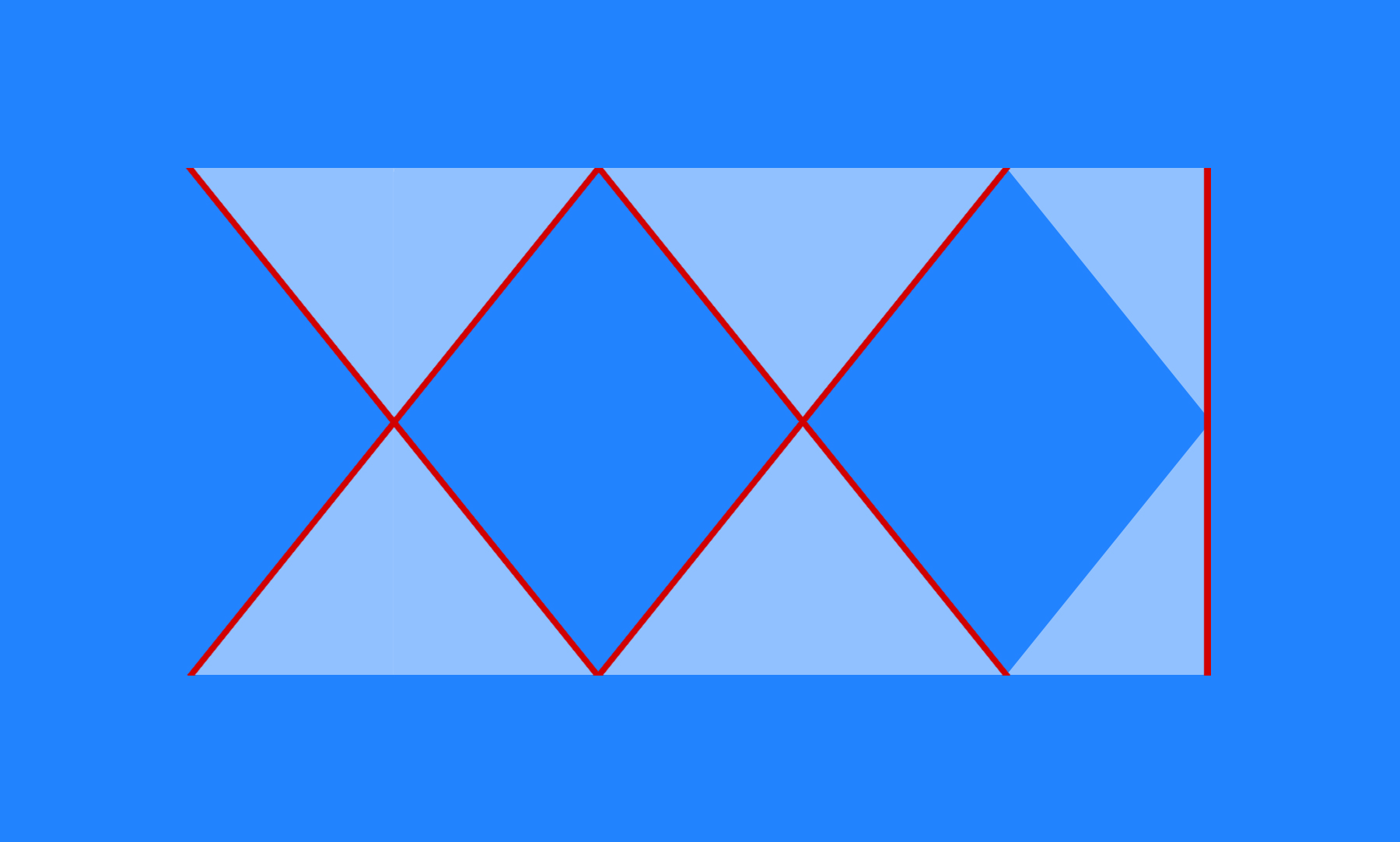
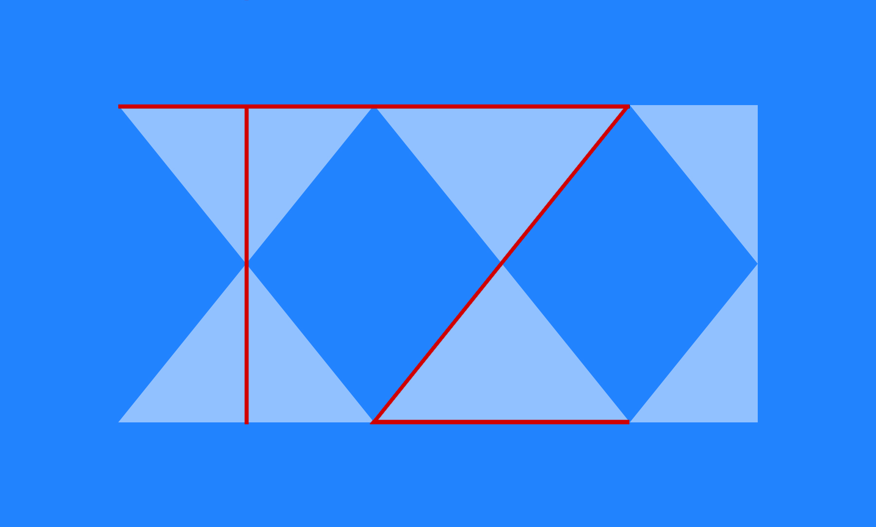
Much like the website itself it’s simple and in many ways representative of clients’ Scandinavian background. At the same time lots of though has been put into telling the story through the simplicity of design.
Logo displays 21 in roman numbers (XXI) as well as the clients’ initials T & Z. Despite this somewhat subliminal information and mixture of old (roman) and modern minimalistic (Scandinavian) the logo remain calm and elegant.
Few words about
The website.
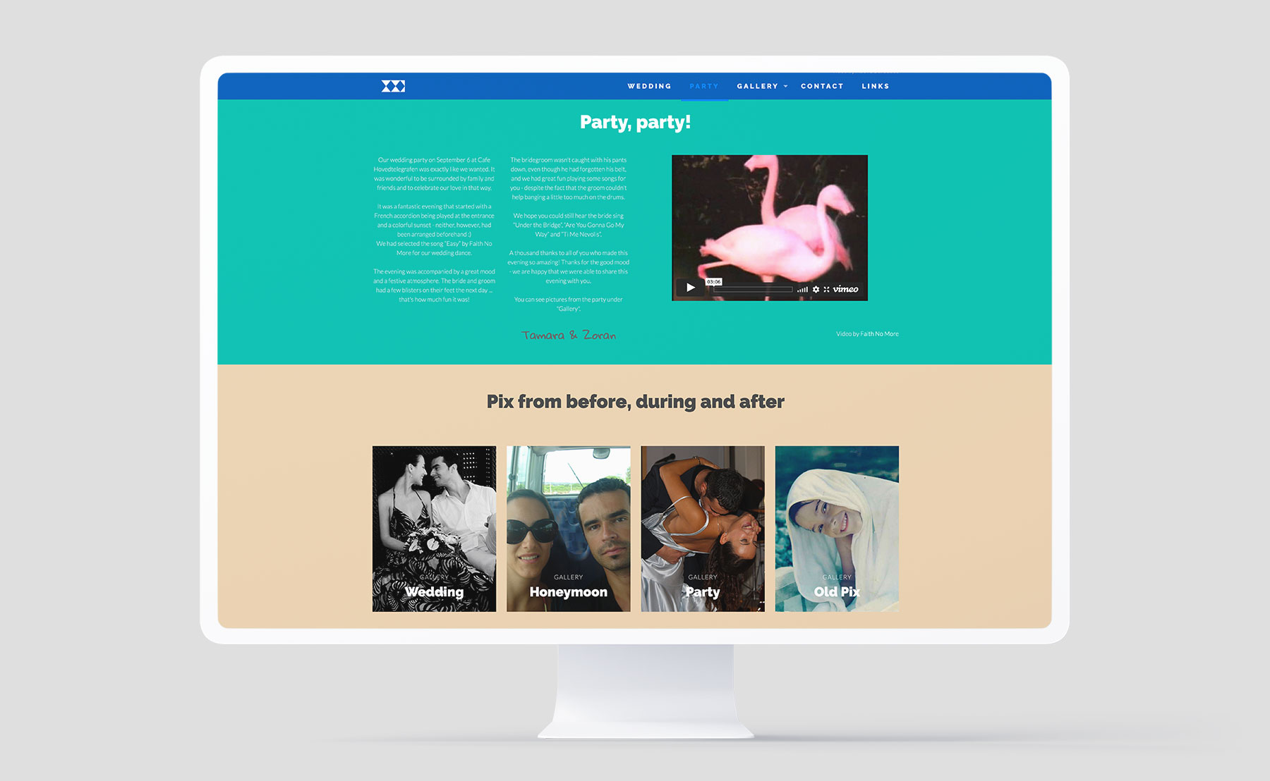
Simple, elegant and with pictures in focus. In the end the pictures tell the story of this wedding and that’s why we’ve included them as much as possible and as big as possible, but at the same time keeping the images clean and part of the very design of the website.

